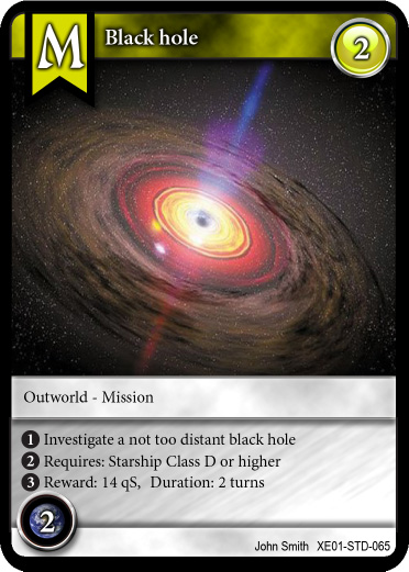
Here is *my attempt* at RENDERING one *Upgrade* card for "Tradewars - Homeworld". This Upgrade card is a "Mission" card (that explains the 'M' at the top).
I think it looks okay... But I know others can do better. What are your comments? Do you like the layout or not?


Comments
This is the original version
I uploaded the *original* version of the card for comparison with the newest version. This version dates to even before the font change of the "M".