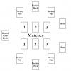
Ok! I'm uploading the current board layout for Ramparts, Pens & Swords, which I've been using for playtesting pretty much all along. Feel free to add any thoughts and suggestions!
Some things to note about the current layout:
- The image(s) uploaded are to scale, and the layout is designed around the current size of the cards in the game's prototype. Each card is 4.5" x 3" with rounded corners. The overall card sizes will be likely reduced in a later, more final print of the game.
- The image(s) show the board's size at 32" x 32". However, I intend to have a rectangular board for this game. For discussion purposes, please consider the actual board size to be rectangular, at 32" x 24". I didn't make this connection until I was nearly done with the layout image. Most everything will be shifted in toward center for the actual board. [Edit: I've uploaded a 'correct' and clean image of the 32" x 24" dimensions board. I'm keeping the other images up, still. Why? Because I like them (and spent a lot of time learning to create something quite simple, lol)! Also, a shout out to Dawid Korzekwa for his initial draft design for the RP&S board.]
- The defeat and victory piles are placed with the purpose of having the defeat pile always on the left and the victory pile always on the right. This maintains the association that losses go left, victories (and draws) go right.
- The hero cards are on the same side of the board. Visually, I like the idea of the Hero's being "face-to-face" of sorts. This also lets me place the round card deck (and its card-in-play and discards) on its own side of the board.
- Players sit across from each other. Because of this, the match positions are 'reversed' for one of the players: this means that they will be playing their matches in a right-left order, rather than the classic left-right. I haven't experienced any problems from players when playtesting, with both friends and in a blind play. Let me explain a few reasons why I prefer this setup: I'd mentioned in my first post that I want to engineer a mechanic which flips the match cards over when pressed or turned, either simultaneously or per player side. Having match cards across from each other allows this mechanic to be implemented more easily into a physical board. Additionally, the card types (rock, paper, scissor) are shown at the top left corner of each faction card. Eye-to-brain, this puts the card types close to each other, arguably resulting in a quicker realization of the match's outcome.
Let's talk art:
- The physical aspect of the board is very important. My original and still current thoughts are to have 1 board, which can be either folded in half lengthwise or into thirds widthwise. I'd like to see what kind of eagle-eye view an artist could come up with for a battlefield which is conveyed across the entirety of the board. I'm not much the artist, but I figure that flag-wrapped spears and Arabian horses and crumbled castle walls would make for an interesting design. Something gritty in content without gore and blood everywhere. Something realistic in color tone without going too dark in theme.
- One idea I've recently been considering is having board 'halves' for each player. A player takes one half and puts it up against his opponent's half and the board is built. Additionally, there could be separate halves pertaining to each of the four factions. And--this may be getting ahead of myself here, but--there could be future board design releases with future faction deck releases. Just saying.
Ok, I think that about covers it. Thoughts?


