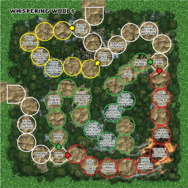
Sample Trail Mat.

| Why a SpaceGame (part 2) (44) by X3M |
| Blank Poker Card Sale - Only 3 Cents Each! (0) by The Game Crafter |
| 2025 Unpub Mentorship Program (0) by The Game Crafter |
| Prospector — I decided to have a dedicated BLOG for this "Expansion" (32) by questccg |
| Dead Steam - Post Apocalyptic train building card game (38) by Tbone |
| Board Game Blueprint - New Episode Every Wednesday (32) by The Game Crafter |
| Tabletop Game Jobs (0) by The Game Crafter |
| Protospiel Cleveland (0) by The Game Crafter |
| "Never Seven" - Playtest Rules - Suspended While the Game is Undergoing Modification (7) by Steve |
| New Board Game Pieces - Premium Mushroom & Premium Brown Mushroom (0) by The Game Crafter | |
| Weight of sorting (4) by X3M |
| Placing cards (planets) in specific positions (orbits) (4) by Tbone | |
| Designing from a personal pool of mechanism (36) by larienna |
| New Board Game Pieces - InFUNity Tiles (Hat Shape) (0) by The Game Crafter |
| New Auction: 1 Month of Advertising on FatherGeek.com (0) by The Game Crafter |
| DuelBotz: Sample New Card (19) by questccg |
| Comparing 2 new dice replace mechanics (2) by X3M |
| Happy New Year!!! (1) by questccg |
| How to design and balance a Rock-Paper-Scissor like mechanism (44) by X3M | |
| Monster Keep — Retiring this Design (0) by questccg |
| Build your own [insert game genre here] (13) by larienna | |
| Finalists Selected for the VHS Case Challenge (5) by larienna |
| 2025 New Year Sale at The Game Crafter (0) by The Game Crafter |
| Merry Christmas 2024! (0) by questccg |
| Winner Announced for "That Cool Stock Part Challenge" (0) by The Game Crafter |
Comments
Much more intuitive
Nice job! Okay this version is much more clear as to what path is the shortest and therefore riskier. The stop points are also clear in that the shape reflects where a player needs to stop.
The "doorway" shape also clearly identify where the level starts/ends. I had a hard time with the smaller images to see where the path started/Ended in the old version (octagons). Now it is much more clear where you can choose to start/end the map.
NOTE: Also you may want to make the *Trading Post* a MANDATORY STOP. Instead of luck of the dice, if you force players to stop on it, it makes it more of a significant feature in the game (Enabling trading amongst players)...
Space shape revision
Quest made a great suggestion, as usual, in regards to the shape of the trail spaces, which I fully agree with. The old shapes were all hexagons. Now the white circles represent normal trail, green circles are safer trails, red are riskier, and yellow are detours. Octagons signal a mandatory stop and the squared circles (better term?) are trail connections.
The paths of movement are now much more clearly defined and I am real pleased with the new change. I have also added the "Trading Post", where hikers can make a quick barter to trade provisions.
More on tiles
If you are using octagonal tiles for purpose of clearer movement, I have another suggestion using circles.
Here is a sample:
http://www.questccg.com/img_misc/Trail_sample.png
And that fork in the path should be a STOP (octagon)... :)
Another question
So it seems to me that you can use these mats and travel from one mat to another? Is that correct? If yes, I would make the tiles on the mat SQUARE when you can link between one mat and the other. Again this is for visual clarity as to how players move about the game.
Another matter is that if one player is further ahead than another, you will need for 2 of the mats to be side by side. I don't know the dimensions of these mats - however this is another consideration: you need to make sure the mats are not too large such that you can have two of them side by side...
More on your game's visuals
I have been reading (diagonally) what you put up as to what allows you to advance in the game (you call them provisions) and one thing came up:
-When you have to STOP and wait on a certain tile, you should make it OBVIOUS by the tile. For example, instead of having octagonal tiles, maybe you should make them circular. Then when a player MUST stop, use the octagonal tile for those situations.
-This would make it more clear (by visually seeing) when players should come to a stop.
-I know you like the octagonal tiles, just thought if they were circles, it would allow you to make things more visually clear.
Images TOO SMALL...
You wouldn't be able to upload each map separately so we could actually read the tiles. For example, you say to choose between the green road or the red road. On the maps you have provided, I cannot tell which is which. So it would be nice if you could upload 6 full sized images so we can better understand and link with the information you provided.