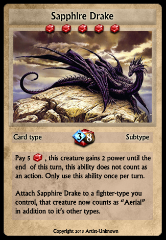
Basic design for card game.

| Build your own [insert game genre here] (5) by larienna |
| Board Game Blueprint - New Episode Every Wednesday (21) by The Game Crafter | |
| Premium Bullet & Premium Toxic Waste Board Game Pieces at The Game Crafter (0) by The Game Crafter |
| PoA — Major shift back closer to FCE (2) by questccg | |
| What “Should” Be in an RPG Design Book (11) by lewpuls |
| Blank Poker Card Sale - 3 Cents Each! (0) by The Game Crafter | |
| Blank Playing Cards - Bridge 57mm x 89mm UK (1) by questccg |
| Finally returned after all these years (1) by DyminoMonsters2004 |
| State of the let-off Union - November 2024 (0) by let-off studios |
| Shoppe: The Simulation of Guilds (1) by questccg |
| The fine line between a game and a simulation (22) by X3M |
| Only 24 hours left to bid on games for the Extra Life Charity Auction (0) by The Game Crafter |
| Songs of Conquest is now 60% off plus an additional discount for... (5) by questccg |
| Returned the reMarkable 2 and purchased the BOOX Go 10.3 (3) by questccg |
| Happy Halloween 2024 (0) by questccg |
| Epic Metal Monster Coins - Now on Kickstarter - Created by The Game Crafter (0) by The Game Crafter | |
| DuelBotz: Sample New Card (12) by questccg |
| 2 levels for an unit (wargames) (6) by X3M |
| Dragon Spark Playthrough (0) by The Game Crafter |
| New Board Game Pieces - Premium Water Droplet & Premium Blood Droplet (0) by The Game Crafter |
| Designer with an 'almost' ready product (18) by questccg |
| Protospiel Madison - Only 17 Days Away! (0) by The Game Crafter |
| New Board Game Pieces - Premium Milk Bottle & Premium Beer Mug (0) by The Game Crafter |
| Testing chat GPT for mechanics searching (6) by larienna |
| Epic Metal Monster Coins - Coming soon to Kickstarter - Need your feedback! (2) by questccg |
Comments
Love your style!
Just wanted to say, that this art is awesome! keep up the great work.
I like the art and the
I like the art and the general color scheme and layout of the card.
2 observations:
1. The 3/8 you have on the gem in the middle of the card seems like it would be hard to read when on the board, especially when you have multiple cards to scan over as you make decisions. If possible, I would separate the numbers a little more or at least make them and/or their background gems bigger.
2. If you attach it to a Fighter, the Fight gains "Aerial", however nowhere does it say the drake itself has Aerial. This is counter intuitive since it can grant Aerial but does not itself have the ability.
The illustration is by
The illustration is by Argentinian painter Ciruelo, btw.