Skip to Content
 

Card Design Layout advice

24 replies [Last post]
LordBrand
Offline
Joined: 12/27/2014
Corners
Icons
Side Bar

As we put together the next level prototype for our project, we're trying to make the design of the cards look a little bit nicer. As a quick note: I'm aware that for prototypes, we go for function over style. We've done that to date while we were hammering out all the mechanics. However, we're wanting to start moving into a phase where we are demoing it to strangers and trying to build interest... And let's face it, pretty cards are more interesting.

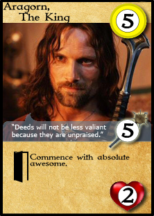
I've created a placeholder champion card (The game isn't LotR based, just using that as an example everybody recognizes!) with three styles. Each style determines where a set of numbers goes. The cards will be standard sized.

There are three numbers on each card:

1) Cost: How much the champion will cost to purchase. In the game, several are face up and available for purchase, and may sit there several turns. The cost is only used the first time the card is purchased.

2) Damage: The champion will be involved in many battles after purchase. Other players may frequently want to check and see how powerful a player's champion(s) are.

3) Health: Same as damage.

As a quick note: I'm about as non-artistically inclined a person as it gets, so this was really a stretch for me. It's exciting to add Inkscape to the growing list of tools I'm playing with and learning to make this project successful though!

Style 1 - Corners: The numbers are in the corners. They give me back plenty of space, but the problem is that I think the numbers are too small to read for anybody but the player holding the card. I'm worried about losing time as people wander around the table or pass heroes back and forth trying to see what they are.

Style 2 - Side-Bar: I've seen a few games making use of this style recently. This is great because it lets me balloon up the numbers pretty large, and it gives me the entire special text area to include my champion special abilities. With the other two styles, I am limited to about 10-15 words and still be readable. My concern with this: Does it look trashier, or would this be a worthwhile style, knowing that for production release I'll try to hire a Graphic designer to make it look classier.

Style 3 - Icons: So rather than putting a number on top of the icon, I just repeat the icons for Health and Damage. This has the advantage of Style 1, but someone can see the icons from further away rather than trying to read numbers.

I appreciate any feedback I can get. Thoughts?

The Professor
The Professor's picture
Offline
Joined: 10/25/2014
Quick Comments

LordBrand,

Thanks for displaying a few cards for our review.

Given my latest Review over at BGG on a game entitled, Historia, you may be best served by using icons, especially if you're looking for a wide, international market. Now, given that you have text, this may prove inconsequential, but the use of the icons is always an attractive alternative.

I realize that you're going to have the cards professionally polished, but I'll just note that you'll want to subdue the color palette to something more neutral.

Cheers,
Joe

let-off studios
let-off studios's picture
Offline
Joined: 02/07/2011
Version 2

I'd vote for version 2, with the sidebar and large numbers. For clarity, remove the circular background behind the numbers and replace it with an outline that helps the shape of the number "pop out" from the icon behind it.

And with all due respect, I disagree with your assessment of version 3. Players will still need to spend time counting up the number of icons. Having numbers clearly printed (as I suggest for version 2) would make all the required information quickly accessible and clear as to which category the number belongs to, perhaps even from across the table during play.

LordBrand
Offline
Joined: 12/27/2014
Thanks for feedback

Thanks for the feedback, and will definitely tone down the colors. I'm hoping to offload all of this to an actual graphic designer later.

To let-off studios:
Totally agree that players will still need to count the icons...But from across a table I can visually see "that looks like a lot of attack" as opposed to "There looks like there's only 1-2 of those." From a planning perspective, I think you can wing it.

SLiV
SLiV's picture
Offline
Joined: 10/21/2011
Corners or sidebar

I think that "that looks like a lot of attack" is not really enough information to do any planning, and usually (or hopefully) that information is already presented in some other fashion (e.g. the card is called "Barag the Bloodthirsty", or has a picture of a dragon with giant claws) and is easy to remember. And often the difference between 6 damage and 7 damage can be huge (e.g. when my champion has 7 health).

Based on the games of the Magic the Gathering I've played, where the numbers are relatively small, I think you should be fine with the corners layout. Although if your game is for more than two players, visibility might become an issue, and then I'd go the with sidebar. I don't like the look of repeated icons, and you're also limiting the damage and health stats due to the amount of space on a card.

Zag24
Offline
Joined: 03/02/2014
Critiques

#1. I hate this one. It's the worst presentation of the information.

#2. Make the cost a little bigger and this is fine. BUT ONLY IF the damage and health is never more than 5, and usually 4 or less. Almost everyone can "gestalt" 4 items (that is, see how many there are at just a glance). As long as "more-than-4" only has one interpretation (that is, 5), then I'm fine with this presentation. Even with this one, though, I'd like to see the arrows stand out a touch more -- perhaps just a darker black, or (better still) a sword, crossed swords, or a sword crossing an arrow.

#3. This is fine, too. If the cards will often have different orientations -- that is, they are getting played in front of the players, so any one person is seeing some right-side-up, some sideways, some upside-down, then #2 is better than this. If they are all the same orientation (even such that some people are seeing them all sideways, some are seeing them all upside-down, etc.) then this approach is equal to #2. People can read compensate for orientation in reading numbers, but there is a mental cost if they have to re-compensate as they move from card to card.

Also, I'd like to see a little bit larger font for both bits of text, plus a little bit better contrast for the text. If the background were just a little bit lighter, this would help a lot.

questccg
questccg's picture
Offline
Joined: 04/16/2011
Zag24 wrote:If the background

Zag24 wrote:
If the background were just a little bit lighter, this would help a lot.

I don't think this is the final look & feel of the cards. I believe the idea was to critique positioning of the stats. Of course I could be wrong, but then I would say I personally dislike "Side bar". It takes away from the presentation and just uses up too much space!

Update: Check out my more pertinent comment on this link: http://www.bgdf.com/node/15506

LordBrand
Offline
Joined: 12/27/2014
It's definitely not the final

It's definitely not the final look and feel of the cards. I'm mainly looking for feedback on the placement, but I'm happy to receive any feedback people care to give. I've actually done another redesign: The primary opinion was that the sidebar was the most usable in gameplay.

I also lightened the backdrop, enlarged the font where possible, and remove a bit of the texture to try to create something as readable as possible

Thank you for all the great feedback. Every piece of feedback is a gift.

questccg
questccg's picture
Offline
Joined: 04/16/2011
I still don't like the side-bar

It's not a size or a color thing - it just takes up so much ROOM! I mean Icons and Corners take up a fraction of what the side-bar utilizes. Plus if you have nothing on the bottom of the cards, they may feel empty on the bottom of the cards.

To me a mixture between Icons and Corners is what would look best. IMHO.

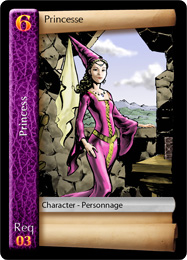
Also I prefer LARGER room for artwork. If you look at my Quest Adventure Cards sample, you'll see the image takes most of the card:

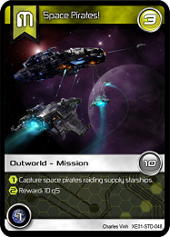
And my latest game "Tradewars - Homeworld" also has a fairly LARGE artwork area:

In both cases, I have reserved plenty of space for artwork... :)

LordBrand
Offline
Joined: 12/27/2014
I see. You definitely

I see. You definitely showcase your art with those designs. But wouldn't you say you have a sidebar on that princess?

Let me play some more with design and see if I can create a best of both worlds. I know art sells and you want to maximize it as much as possible.

Thanks again for advice!

chriswhite
Offline
Joined: 07/10/2011
Need more information

You have left out the most important bit of information relevant to selecting stat presentation, sizing, and icon/symbol style, which is––

1) Who is going to be looking at these stats?
2) How often will they be referencing them?
3) How physically distant will they be when doing so?

Take Magic: The Gathering, for example–– the casting cost of the card is mostly only relevant to the player who plays the card, so it only needs to be big enough to be clear when physically in-hand. The opponent rarely needs to know the casting cost, and when they do, the most important part of it is What color mana is used to play it? Appropriately, this is indicated by the color of the surrounding border –– well visible from across the table. The other most important part of the card for an opponent is an enemy creature's combat abilty, which is conveniently emboldened, and larger than other text on the card.

Dominion is largely a solitaire game, and therefore almost none of the text on cards needs to be large enough to seen from across the table. The exceptions to this are card cost (moderately sized, which needs to seen only from the center of the table) and resources provided by the card (very large, so that opponents can double-check that the active player has done his arithmetic correctly when selecting what to purchase).

Without this information, no one can give you good advice here. Some games are played very closely, others may involve laying cards in front of you on opposite sides of a large board. For some games, looking around and seeing what other people have played is a central activity (e.g. 7 Wonders) whereas for some it's not (e.g. Red Dragon Inn).

Other considerations include things like "How are the cards usually oriented?" and "How many different cards are held at any one time?". Also think about the placement of information (e.g. consider how useful it is that a playing card has its most valuable information in the upper left corner, given the way that people typically hold cards).

I hope that helps.

questccg
questccg's picture
Offline
Joined: 04/16/2011
Side-bar usage reasons

LordBrand wrote:
I see. You definitely showcase your art with those designs. But wouldn't you say you have a sidebar on that princess?

The reason the side-bar exists is based on HOW cards are played on the table. Specifically card set collection is done by placing card at top each other... So ALL you get the see is the SIDE-BAR (because another card is usually place next to it).

So yes it's a side-bar - BUT it is part of how the cards work together. If you want to see for yourself how the cards look on the table, you can view my video/animation of a game being played out: http://www.questccg.com/demo.htm

If you wait until cards are played, you'll see on the table that cards are placed one on top of the other - only showing SCORING information. That's what the number on the TOP is for: SCORING points. So all that matters is the number of points. The rest of the card is irrelevant...

Zag24
Offline
Joined: 03/02/2014
Totally disagree.

questccg wrote:
It's not a size or a color thing - it just takes up so much ROOM! I mean Icons and Corners take up a fraction of what the side-bar utilizes. Plus if you have nothing on the bottom of the cards, they may feel *empty* on the bottom of the cards.

To me a mixture between Icons and Corners is what would look best. IMHO.

Also I prefer LARGER room for artwork. If you look at my Quest Adventure Cards sample, you'll see the image takes most of the card:

And my latest game "Tradewars - Homeworld" also has a fairly LARGE artwork area:

In both cases, I have reserved plenty of space for artwork... :)


Well, you didn't ask, but I totally disagree with the choices you've made. Good artwork is nice, and adds to a game, but it isn't the point of the game. The point is fun gameplay. If I find myself squinting to read the text, or struggling to read the important numbers on the card, then my opinion of the gameplay goes down because I'm struggling to play. Your artwork looks great, but it could be 10% smaller in each dimension and it would still look great, plus your card would be more readable.

In your case, the choice of font along the left was a bad one. When you have a white font on a mottled background, you lose readability if you don't have bold font. The interaction between the white and the two different colors of background feels "bigger" than the width of the lines of the letters. Notice how most of the C and E of princess and the left leg of the R in Req just wash out completely. Also, was it intentional that princess is spelled incorrectly in one place? (Maybe that's her name?)

questccg
questccg's picture
Offline
Joined: 04/16/2011
LOW quality images

Zag24 wrote:
In your case, the choice of font along the left was a bad one. When you have a white font on a mottled background, you lose readability if you don't have bold font. The interaction between the white and the two different colors of background feels "bigger" than the width of the lines of the letters. Notice how most of the C and E of princess and the left leg of the R in Req just wash out completely. Also, was it intentional that princess is spelled incorrectly in one place? (Maybe that's her name?)

Well one thing for certain is that these are LOW quality images. If I had full 300 dpi resolution like on the actual cards, your would NOT have any distortion or dithering. The white on background looks *crisp* and clean.

No the princess is not misspelled, the game is BILINGUAL: English and French. I live in Quebec where French is the predominant language. So my first game was designed in BOTH languages. My goal was to mainly sell the product in stores in Quebec...

Note: That was kind of a stupid thing to do. Most GAMES come from the USA. So it's no real point of having the French language in the game since most sales are in the USA. The USA has 10 times the population... If you want to sell a game - first sell it in the USA and then if it is popular enough - it MAY get distribution in Canada...

Local distributors are NOT publishers, they don't sell unknown games. They order from US Publishers and probably American distributors. Anyhow local distribution is pointless unless you have American branding. Don't design a local game if the locals don't support it...

LordBrand
Offline
Joined: 12/27/2014
@Chris - Apologies - Great

@Chris -

Apologies - Great things to include in my request. Some of that information was listed, but I had it mixed in the details of what each was (Cost, Damage, Health).

To be explicit on your points:

The game will play anywhere from 2 to 5. It can easily eat a mid-size gaming table. Less so than say Arkham Horror or Twilight Imperium, but more than 7 Wonders.

A selection of champion cards is placed face up in a "stable" until they are purchased, at which time replacements are drawn. The stable will sit somewhere at the table, which could be close to some players, but far from others. Once a champion is purchased it moves over to that player's play area, still face up. A player will likely have 1-3 champions over the course of a 2-3 hour game. Historically, players keep the card on the table, oriented towards themselves unless somebody asks to see it.

Cost - This attribute will be referenced when you purchase the card and after that never again. Purchasing can occur once a turn, over 9 turns.

Damage/Health - Multiple battles can occur in a turn, often with the same player (either as the aggressor or defender). For these situations, the champion can either be standing alone, or part of an army where he may only be contributing a small percentage (< 20%) of the actual power for the attack, depending on whether or not he is a champion designed for combat.

As indicated in the sample, a champion will typically have other text for special actions they do.

Please let me know if I missed any details.

Thanks again for the advice!

questccg
questccg's picture
Offline
Joined: 04/16/2011
Excellent explanation!

Okay then there other cards in the game? You mention a Champion being part of an army. There must be other cards? Those other cards templates are they similar to your Champions???

The reason I ask is maybe you need uniformity or you want to use a side-bar like in Quest AC (where the cards are placed on top to save space - like armies)?!

I am also using this in "Tradewars - Homeworld". If you look at the RHS of the card sample, you will notice 2 circles with values. This is what is displayed to the opponent so that they know the Firepower and Reward value of the card... So I guess "I like side-bars" now?! :P

Perhaps more subtle side-bars is what I tend to favor! :D

questccg
questccg's picture
Offline
Joined: 04/16/2011
Here is my *sample*

Critique all you want, like it, dislike it, hate it... I just wanted to illustrate how you can have a "side-bar" without actually having one...

Note: I find the values are a little bit big... But that's stuff you can play around with. I just used what was in the examples and tweaked it a bit...

Used some Drop Shadows to POP the stats and added an Outer Glow to the mace to make it look "magical"... Again more stuff that can be tweaked using different colors or varying the settings of the glow (less or a different color, etc.)

LordBrand
Offline
Joined: 12/27/2014
Thanks for the sample. You

Thanks for the sample. You definitely did a great job of showing how to "side-bar" without putting an obstructing bar on the page. The way you made the symbols "pop" helps give me the standout look I'm going for. I'll try that in my tests and see how they look.

As far as other cards go:

Yes there are, but champions won't be getting compared against them. Armies are noted by pawns on the board, which is actually cards. That brings me to another question, which I'll throw to the group in a separate thread.

Thanks!
-Jon

LordBrand
Offline
Joined: 12/27/2014
Here's a new sample based on

Here's a new sample based on the feedback I've been getting.

Thanks again for all the input!

Couldn't figure out how to embed the image. The tools I used in the main post don't seem to be there. Here's the link, however:
http://www.bgdf.com/node/15526

chriswhite
Offline
Joined: 07/10/2011
Not too shabby

Looking at only the layout –– I'd say that this looks like a good start. My initial impressions are

1) The top number (in the yellow circle) is the cost, no? If so, is it an extremely relevant value once a player has this guy under their control? If so, is it relevant to the opponent? If you answered either of the last two questions "No", then why is it at the top? You should put the information most important to the opponent closest to the opponent.

2) Sweet jeebus that's a lot of room for art! I've played only a couple games that devoted that much space to artwork, but I can't think of one where I was happy they did it. Most of the time I wonder "Why is the text so small?". Don't get me wrong –– I went to art school and I can certainly appreciate good art... but I can't think of any time I have thought to myself "They could have made this bothersome text smaller and given me more art!" Remember: The purpose of a card is to convey mechanical information. Card art is decoration, and component art is not even the primary vehicle of theme. (Mechanics should be the main thing that keeps a player immersed, followed distantly by cover art.) It's worth noting that many popular games largely eschew card art (for example, some of the cards from Mage Knight) That said, your design displays those 3 stat numbers well. If that's the extent of the information on the card, you're doing fine.

3) But... the lower line of text "Gain Cool Awesome Stuff" has only 4 words. Is that area devoted to mechanical text? Is 4 words the norm? Either way I would nudge that font up a point or two. If you have cards which require more than 4 words of space... then, find the card in your design with the most text, and see how much room you need. That should be the way you decide how much space you can devote to art.

Just my opinion, of course...

JewellGames
JewellGames's picture
Offline
Joined: 06/03/2012
Corners

From what you have described about your game so far, I personally like the classic corners layout such as:

Soulfinger
Soulfinger's picture
Offline
Joined: 01/06/2015
art

chriswhite wrote:
Sweet jeebus that's a lot of room for art! I've played only a couple games that devoted that much space to artwork, but I can't think of one where I was happy they did it.

I remember "Heresy: Kingdom Come" as a CCG that devoted a lot of room to artwork on oversized cards about the size of tarot cards. I loved it, but greater emphasis on showcasing the art also demands excellent art. H:KC had artists like Gerald Brom and Tim Bradstreet. Frankly, I don't see the art on the linked card here as a selling point.

I don't quite agree with you about mechanics being the purpose of a card though. Card games are a very visual medium. I've seen plenty of games with finely tuned mechanics, but if the visual element isn't evocative and fails to engage the players on an emotional level then the game has failed. You have to look at each card as being its own microcosm of branding and marketing. The artwork is important because players want to build "Shoe: The Footwear" decks full of Nike, Adidas, and Converse brand iconography; not Merrell, Sas, and Ecco -- even if the latter are mechanically superior. While I agree that the finely tuned engine makes for a superior game, the driving force in sales is going to be the vehicle that conveys it. You can do without art, but the graphic design must then be stunning. Game mechanics and presentation are equally important. I've enjoyed more games with nothing but art on the cards than I have ones with nothing but bricks of text sans art or quality layout.

Personally, I feel that more space for artwork and less text generally reflects tighter game design. A card cluttered with too much game information often indicates an inelegant design and redundancy issues. One thing I can't stand is when designers fill space with little fictional quotes or story snippets that are uniformly painful to read. There will be a MtG card with top notch art and an embarrassingly bad fictional quote that reads like a hybrid of preteen Twilight fan fiction and a Jack Handy quote. I'm sure it targets the same demographic who enjoy GW's clever figure names, like "Murderfang" and "Bloodcrusher."

The layout JewellGames gave is VERY nice. I like that a lot. Even the area for including stupid quotes is so understated that it passes muster.

kevnburg
kevnburg's picture
Offline
Joined: 05/02/2014
For the Layout of the Rehl

For the Layout of the Rehl Flameshield card you included: If the symbol with the gold background is a cost, it might work better in the top right corner alongside the character name as you placed it in your non-sidebar card layouts. Then the art area of your card can be focused as the "combat stats" location. I generally think cost numbers and combat numbers should not be in the same place.

LordBrand
Offline
Joined: 12/27/2014
Wow! A lot of great feedback

Wow!

A lot of great feedback everybody. Maybe I'll draft up some cards using all of this and host a poll.

Thanks so much!

questccg
questccg's picture
Offline
Joined: 04/16/2011
I agree!

kevnburg wrote:
For the Layout of the Rehl Flameshield card you included: If the symbol with the gold background is a cost, it might work better in the top right corner alongside the character name as you placed it in your non-sidebar card layouts...

I agree this is a good point. Putting the cost at the TOP RIGHT makes it stand out as a COST and then have the stats below as in your sample.

Syndicate content


forum | by Dr. Radut