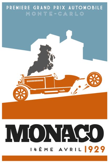
Home » Monaco: 1929 (Box art version 4)
User login
Nov 23 2024
| Build your own [insert game genre here] (8) by questccg |
Nov 21 2024
| Board Game Blueprint - New Episode Every Wednesday (21) by The Game Crafter | |
| Premium Bullet & Premium Toxic Waste Board Game Pieces at The Game Crafter (0) by The Game Crafter |
Nov 20 2024
| PoA — Major shift back closer to FCE (2) by questccg | |
| What “Should” Be in an RPG Design Book (11) by lewpuls |
Nov 18 2024
| Blank Poker Card Sale - 3 Cents Each! (0) by The Game Crafter | |
| Blank Playing Cards - Bridge 57mm x 89mm UK (1) by questccg |
Nov 17 2024
| Finally returned after all these years (1) by DyminoMonsters2004 |
Nov 15 2024
| State of the let-off Union - November 2024 (0) by let-off studios |
Nov 13 2024
| Shoppe: The Simulation of Guilds (1) by questccg |
Nov 10 2024
| The fine line between a game and a simulation (22) by X3M |
Nov 7 2024
| Only 24 hours left to bid on games for the Extra Life Charity Auction (0) by The Game Crafter |
Nov 5 2024
| Songs of Conquest is now 60% off plus an additional discount for... (5) by questccg |
Nov 1 2024
| Returned the reMarkable 2 and purchased the BOOX Go 10.3 (3) by questccg |
Oct 31 2024
| Happy Halloween 2024 (0) by questccg |
Oct 29 2024
| Epic Metal Monster Coins - Now on Kickstarter - Created by The Game Crafter (0) by The Game Crafter | |
| DuelBotz: Sample New Card (12) by questccg |
Oct 28 2024
| 2 levels for an unit (wargames) (6) by X3M |
Oct 25 2024
| Dragon Spark Playthrough (0) by The Game Crafter |
Oct 21 2024
| New Board Game Pieces - Premium Water Droplet & Premium Blood Droplet (0) by The Game Crafter |
Oct 17 2024
| Designer with an 'almost' ready product (18) by questccg |
Oct 15 2024
| Protospiel Madison - Only 17 Days Away! (0) by The Game Crafter |
Oct 14 2024
| New Board Game Pieces - Premium Milk Bottle & Premium Beer Mug (0) by The Game Crafter |
Oct 11 2024
| Testing chat GPT for mechanics searching (6) by larienna |
Oct 9 2024
| Epic Metal Monster Coins - Coming soon to Kickstarter - Need your feedback! (2) by questccg |


Comments
Looks good. The colors are
Looks good. The colors are appealing. The wheel placement is much improved. Smoke is still out of place though, not stylized like the rest.
To Soulfinger
I'm probably going to try and put less detail in the smoke and see how that looks, maybe without the small white parts and instead just the outline.
Disclaimer: I am not an art
Disclaimer: I am not an art guy. I know nothing of color schemes. Take every piece of feedback I give with a grain of salt. With that being said ..
I had trouble identifying the smoke until the third iteration, and then I really had to look at it which isn't necessarily a bad thing.
I really like the way you have done the wheels. I had trouble telling what was going on in previous iterations.
I like this one as well, but
I like this one as well, but I think identifying the smoke was easy enough. the difficult part was (and still is, I think, though now it is impossible for me to 'unsee' it) seeing that the rear wheel is flying away.
To Dagar
Sorry for the slow reply, I've been a tad busy past couple of weeks.
Maybe I could have the wheel rolling along the ground or that sort of thing?