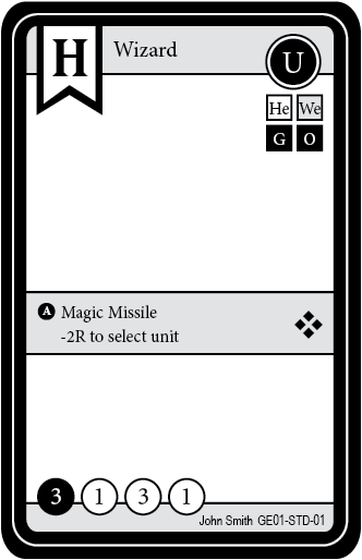
Here is my FIRST draft of the card layout for "Crystal Heroes". I'm not quite "happy" with it... IDK why.
Obviously the Races (Top right) will become symbols and will be more uniform including the double damage one (at the top).
The stats at the bottom go: C, A, R, D.
Or "Crystal, Attack, Resistance, Damage".
In the middle is the cards bonus effect (if any). It will be a colorize layer - seen here is gray.
Maybe someone else can point out other things that seem "wrong" or "out of place", etc.
Thanks.


