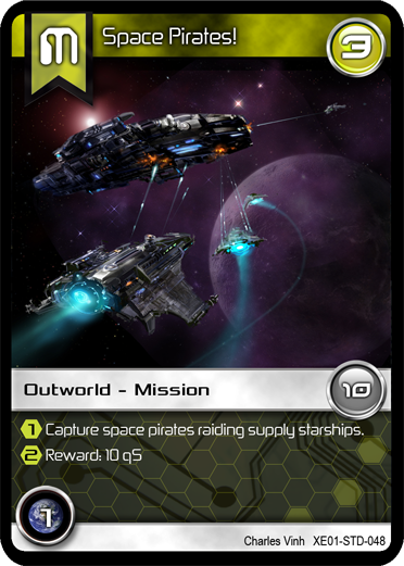
I figured I'd share with the BGDF community one of the latest cards for "Tradewars - Homeworld".
I think this card came out pretty nice. Tell US what YOU think?!

| Finally returned after all these years (1) by DyminoMonsters2004 |
| PoA — Major shift back closer to FCE (0) by questccg |
| State of the let-off Union - November 2024 (0) by let-off studios |
| Shoppe: The Simulation of Guilds (1) by questccg |
| What “Should” Be in an RPG Design Book (10) by questccg |
| The fine line between a game and a simulation (22) by X3M |
| Only 24 hours left to bid on games for the Extra Life Charity Auction (0) by The Game Crafter |
| Songs of Conquest is now 60% off plus an additional discount for... (5) by questccg |
| Returned the reMarkable 2 and purchased the BOOX Go 10.3 (3) by questccg |
| Happy Halloween 2024 (0) by questccg |
| Epic Metal Monster Coins - Now on Kickstarter - Created by The Game Crafter (0) by The Game Crafter | |
| DuelBotz: Sample New Card (12) by questccg |
| 2 levels for an unit (wargames) (6) by X3M |
| Board Game Blueprint - New Episode Every Wednesday (17) by The Game Crafter |
| Dragon Spark Playthrough (0) by The Game Crafter |
| New Board Game Pieces - Premium Water Droplet & Premium Blood Droplet (0) by The Game Crafter |
| Designer with an 'almost' ready product (18) by questccg |
| Protospiel Madison - Only 17 Days Away! (0) by The Game Crafter |
| New Board Game Pieces - Premium Milk Bottle & Premium Beer Mug (0) by The Game Crafter |
| Testing chat GPT for mechanics searching (6) by larienna | |
| Build your own [insert game genre here] (0) by larienna |
| Epic Metal Monster Coins - Coming soon to Kickstarter - Need your feedback! (2) by questccg |
| Version 1.28 of nanDECK is available for download (0) by nand | |
| I bought a reMarkable 2 as my 50th B-Day Gift (4) by questccg |
| How do you know if a game idea/project is obsolete? (5) by larienna |
Comments
Your cards look superb.
Your cards look superb.
When is your game coming out? Or is it already on the market?
Thanks for the thumbs up
The game is in it's 12th revision and was in the hands of one publisher for 11 months. They finally decided to pass on the game - and so I have contacted two (2) other publishers. One has already gotten back to me - and they had some questions regarding the game...
Hopefully they give "Tradewars - Homeworld" a chance to succeed in the market...
Also remember that the game will be OPEN for designing NEW scenarios and adding more ways to play the game. So designers should look for that as a way of supporting a game that wants to support the designer community.
sure is cool looking!
Looks great. Clean, clear. I don't know the context, but one thing...there appears to be a couple different font in use...make sure that they are not confusing. Are those both the number "1" in the two round icons and the yellow hexagons? The art is amazing!
About the fonts
Well I had Ed Wedig (one of the BGDF Graphic Artists) re-vamp the look & feel of the card. He worked on selecting BETTER fonts and helped me in suggesting using hexagons for the bottom text area.
Here's a sample (back in the early days) without the futuristic fonts:
http://www.bgdf.com/node/13083
If you compare the two, I think you'll agree his font selection makes the overall look & feel of the card MUCH better!
Thanks for the positive feedback...! :D
yep...newer look is better
I agree that the newer look is much better...more futuristic. I just don't want to confuse 1 with 7, depending on the fonts. It may not be an issue. Well done either way!