Hi All,
I'm currently designing the tiles for my game The mAIden Voyage and am trying to 'finalising' the tile/space design before I print and laminate them all for lots of play testing.
I was wondering what preference you all have in terms of where information is.
Each tile will have the following information on it:
1. Room name
2. Number of damage allowed
3. Number of Scientists allowed
4. Unique space/tile action
5. Special effect (only on some tiles)
I am planning on keeping 1-3 on the tiles but I'm in a quandary about 4 and 5.
Do you prefer:
1. All information associated with the tile/space on the tile in text form (e.g. Battlestar Galactica).
2. All information associated with the tile/space on the tile, but mostly in iconography (e.g. Roll for the Galaxy).
3. A fusion of iconography and text to minimise the amount of text on each tile.
4. Just a distinctive picture with key information and 4/5 on a player reference card in front of each player (e.g. Room 25).
5. Something else that I haven't though of!
I'm assuming for options 1 and 2 there would still be some kind of player reference sheet so that it's easy to see what the options are even if a player can't see the opposite end of the board.
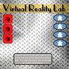
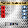
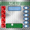
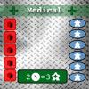
I've added an example for one of the location tiles with iconography and plain text. Art for these tiles has not yet been finalised (dreamt up!) so excuse the rather plain back image!
I am also open to suggestions for better iconography that I'm currently using!
TIA


Thanks Zag :)
Some good ideas :)
I don't think the number of icons should be that huge so i think it should be possible to do.