Skip to Content
 

My little (stupid looking) soldiers

12 replies [Last post]
X3M
X3M's picture
Offline
Joined: 10/28/2013
Projectile Battle Tank design

My little soldiers look like a little ball with a stick.

However, I acquired a new picture editing technique a little while ago. And I would like to recreate my little soldiers before adding that new picture editing technique.

Since I am not that good in art, I would like to have some advice. How to make a soldier looking good from top view.

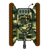
To give you an idea of the quality that I am looking for. I attached one of my tank designs, with the basic camo. It is a 125 x 125 picture, that size is perfect for me to work with.

A recreation from scratch.

After googling, this is what I have learned so far:
I am aware that the soldier can use shoulders and a backpack. Of course, the weapon is a good indicator for what kind of soldier it is. Perhaps some arms, hands and a face.
Shoes however seem to be a big no.
Showing some back perhaps?
Or should I make a 45° viewpoint for soldiers, while all other units are viewed from top?
Some of my jeeps that I am going to use are going to have some (at least 1?) soldiers in the back though. They are going to be the exact same size? Or should I already banish them completely?

kos
Offline
Joined: 01/17/2011
Google

There's dozens of pages on the Internet with top-down images in various styles.
Find something you like and "take inspiration" from it.

E.g.
http://www.juniorgeneral.org/load.php?Collection=4
http://2dgameartforprogrammers.blogspot.com.au/2012/04/top-down-view-sol...

If your vehicles are all top down, I'd stick with top down for soldiers too, rather than going for 45 degrees.

Regards,
kos

schattentanz
schattentanz's picture
Offline
Joined: 02/18/2014
Heroes of Normandie style

Heroes of Normandie did a fine job depicting soldiers from above:

http://www.brueckenkopf-online.com/wp-content/uploads/2013/04/DPG_Heroes...

You see a helmet, shoulders, arms and weapons. Feet only on rare occasions.

Hope to help and kind regards,
Kai

X3M
X3M's picture
Offline
Joined: 10/28/2013
Getting somewhere :)

kos wrote:
There's dozens of pages on the Internet with top-down images in various styles.
Find something you like and "take inspiration" from it.

The link that you have given is a familiar one for me. Still I like less helmet, more body though.
I have found about 12 different sites before even asking here. I even looked in old games (GTA as example). Perhaps you know some other looking criteria for me? I used for example "topdown", "from top", "from above", "soldier", "infantry" etc.

kos wrote:

If your vehicles are all top down, I'd stick with top down for soldiers too, rather than going for 45 degrees.

Glad someone agrees with me :). Although, many old RTS do have a difference between soldiers and tanks with viewpoint. dune 2 and C&C dawn anyone? That is the reason for confusion. Especially since soldiers only show an helmet.
The reason for 45 degrees would be that the camo that is used for the tank, is also "only" used for the suit. Not the helmet/backpack?
If it is going to be topdown view, I need at least 50% other body than the helmet/backpack. And it can't be the weapon either.

schattentanz wrote:
Heroes of Normandie did a fine job depicting soldiers from above:

http://www.brueckenkopf-online.com/wp-content/uploads/2013/04/DPG_Heroes...

You see a helmet, shoulders, arms and weapons. Feet only on rare occasions.


That is a new one for me, thanks. Will study it. It does show more body than helmet.

***

When I have plenty of time, I get down to it.
First I'll create the rifle infantry. Which is most basic, but also holds a weapon.
Several versions for show and tell.
Once chosen the right one: Then the other infantry will be done in a short time.

More links/suggesitons are always welcome.

Thanks.

BubbleChucks
Offline
Joined: 06/07/2012
I've used content from

I've used content from rpgmapshare.com for graphics before and they have a lot of very useful pieces - for personal and commercial usage (graphics are clearly labeled in terms of usage).

They don't have a lot of top down soldiers and those they have are modern looking. However, they do give an idea of poses and the graphics could be used as an outline template if you wanted to make them WWW1 or WW2 variants.

http://rpgmapshare.com/index.php?q=gallery&g2_itemId=5421

http://rpgmapshare.com/index.php?q=gallery&g2_itemId=1596&g2_page=18

The site also has a lot of tanks and wotnot

http://rpgmapshare.com/index.php?q=gallery&g2_itemId=1588&g2_page=6

X3M
X3M's picture
Offline
Joined: 10/28/2013
Some new questions

This one also gave good insights. Thanks.

However, since soldiers are much smaller than the average tank. would it be ok to use different scale's?

If the tank picture is normal size. Than the soldier is going to be around 3 to 5 times bigger. If I use the same scale for the soldier as the tank, a lot of white space remains on the card. (See the size of those hatches on the tank)
And it isn't like that I am going to put squads on one card.
Further, I want the camo to be clearly visible (same quality).

And how do I make these different scale's clear to a player?

mulletsquirrel
mulletsquirrel's picture
Offline
Joined: 08/14/2014
Why not have the tank tile

Why not have the tank tile actually be bigger than a soldier? That would make it super easy to distinguish the size difference.

X3M
X3M's picture
Offline
Joined: 10/28/2013
I keep on brainstorming

Sorry, for the pieces; 20² to 25² mm is about the upper limit. This due to the board size and hexagon field sizes. Or else it would have been a swell idea. Every piece needs to be the same size.

Also, they are going to be stacked and need to be able to move stacked on various occasions.

Each piece is also going to have at least 1 whiteboard counter piece when needed. They too are needed to remain multi functional.

Currently there are 3 valid options, please an opinion on all three:

1 - Smaller units will go in group shot pictures, the counter is simply going to say how much units I have of that type. It doesn't matter if it is just one of them.

Although, future and most likely bigger units than the current light tank, would be sized down.

2 - The second option that I value more: A little thin line in the upper right corner that indicates 1 meter (and perhaps 10 centimetres).
:) It did well on the doodle units.

This means that a soldier piece has the l metre line across almost the entire piece. And the soldier itself is going to be roughly "50 cm" in diameter.

Not only that, but the second option would mean that the tank is going to have about 1/6th line. And I have my mathematical reasons for that.

The most positive about this is that I can keep detail in my soldier because of the size. Things like guns/grenades or simply being a medic/mechanic can be made more clear.

3 - Both previous options could be combined. But then I will do this when a group of units is trained as a whole squad. (Less cover options in open field, but more fire power over time). It can be done when using only option 2. But it cannot be done when using only option 1.

mulletsquirrel
mulletsquirrel's picture
Offline
Joined: 08/14/2014
What if the larger units took

What if the larger units took up 3 hexagon tiles worth of space:
http://s3.amazonaws.com/illustrativemathematics/images/000/001/398/max/t...

Why are all the pieces required to be the same size?

X3M
X3M's picture
Offline
Joined: 10/28/2013
I got reasons.

The game is rather, complete and done. Changing size will work against the balance in the rules. Range, domination and movement are all locked in the current balance. This also regards strategy that is intertwined with the terrain and the location of the units.

All I want is to make a better prototype. I am not going to burn down a working game just because for the art.

To keep the size of the game field (= number of hexagons on the map) fun. I can't go bigger then 25² mm. And smaller than 20² mm will provide problems with picking them up etc.? Also, I don't want players to be using a magnifying glass just to tell the units.

mulletsquirrel
mulletsquirrel's picture
Offline
Joined: 08/14/2014
Makes sense. What if the

Makes sense.

What if the larger units were thicker hex tiles? Seems like it would be a nice way to differentiate between unit sizes.

X3M
X3M's picture
Offline
Joined: 10/28/2013
good idea

Hey, that is actually a cool idea.
Thickness equals size.

Although, I need to keep in mind that the first game allows up to 3,600 worth of points as maximum. But in future games, 6,000 and after that, who knows. So, no kubes.
Of course I have to apply a minimum as well. Can't have paper thin units.

I'll throw it into the group as an extra option

PS, I see you think the units are hexagons as well, the units are actually square pieces while the map has hexagons, reasons are:
- to be able to pick them up without trouble, no shifting of other pieces.
- the battle takes place off the map, placing them appart while maintaining cover/support is easier with squares as well
- storage of the units is easier with squares as well

***

Meanwhile, I am experimenting with the meter line. It actually looks cool.

X3M
X3M's picture
Offline
Joined: 10/28/2013
Small detail difference problems

Has any one advice on how to make the weapons for soldiers?
It is often that the most details of the weapon is seen sideways. Not top down.
With my eye on the future, I would like to prevent same looking soldiers while having slightly different machine guns.

Should I add an additional picture in the corner of
1 - the weapon sideways
or
2 - a symbol like in C&C dawn DOS version
or
3 - the unique weapon number that fits its characteristics which are; multiplier, range and accuracy. Perhaps I need to add the damage type as well.
or
4 - Since an unique weapon number requires perhaps an unique soldier number as well. Regarding speed, agility etc. How about an ID number instead? This would mean that slightly different looking soldiers will get complete different ID numbers.

Syndicate content


forum | by Dr. Radut