As an artist, I love a good looking game. How a game looks - pieces, board, cards, art and design, often has an impact on my enjoyment of that game, and I think that's true of a lot of people. It's not my sole enjoyment - I don't enjoy a bad game with good art, but it's definitely a contributing factor.
With testing prototypes of my own games, I've been very interested in the tightrope walk you have as a designer in determining where your enjoyment (or lack thereof) of a prototype stems from.
I find it interesting in trying to figure out 'Are we not enjoying this game as much as we thought we should because the mechanics are at fault? Or because we're pushing paperclips around on a black and white grid printed on paper?'
As a designer, I think you can at least have a good idea on whether the mechanics are at fault or not, but how much does that visual appearance of your prototype affect your decisions in trying to fix mechanics that might actually be just fine as they are? How does the appearance of your prototype affect the enjoyment of your playtesters playing the game? Is their negative feedback due to bad design, or are they simply bored of black text on paper cards?
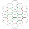
For my own example, one of the games I'm developing that you might have seen me yapping about on the forum here is Shaolin Temple. It's a co-operative dice combat game played on a hexagonal board. Originally we were using paperclips to represent the pieces on a grid printed on A4 paper. We enjoyed the game, but I just kept feeling like something was off - it just wasn't as fun as I wanted it to be. Part of it was mechanics that we managed to correct, but I also found part of it was due to the nature of repeatedly moving paperclips around on that piece of paper. I set about designing a better looking prototype board and nicer character cards, and suddenly it felt like a whole new game. I've attached the before and afters to this post for reference.
I'm lucky enough that I have the tools and abilities to try and make interesting looking prototypes, but I know a lot of designers don't have that luxury, and nobody is going to shell out cash to get art made up for a prototype.
It's a topic I find fascinating, and I'm interested to see if other designers have come across this problem or not, and if so, how they went about fixing it?


.thumbnail.jpg)
.thumbnail.jpg)


All very interesting replies.
I should quantify that it's not an issue I'm having myself at the moment (I like to create and design things, so I went ahead and made a nicer board and cards because that's something I wanted to do, not necessarily something I felt I HAD to do), but thanks for all the advice all the same! :-)
I suppose the type of game plays a big part as well. My other project, Hunters (www.huntersgame.com.au) is a card/RPG hybrid. We've been playing that one for months and months with just black and white text on paper cards, but still having an absolute blast with it. Shaolin is a very different beast, a more traditional board game where the focus is on a board on the table and the figures on it - it's an environment where how the game looks has a larger impact.
I just think it's an interesting topic of discussion in how a prototype is perceived, how playtesters perceive it, and how 'fun' you find the game. Thanks for all the input and discussion - I look forward to reading more if there's other opinions out there!