Skip to Content
 

Making an attatchment card for under another card

6 replies [Last post]
jedite1000
jedite1000's picture
Offline
Joined: 02/18/2017
attachment.jpg
attachment2q.jpg
TE2ST.jpg
atttachment2.jpg
TEST.jpg
test2.jpg

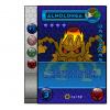
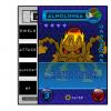
Im trying to get this design to work, for the attachment card in my card game im trying to make it like the buffs and power boost my character card receives from the attachment card is visible under the character card card itself.

But the design isn't really appealing and dunno how to make it work

My idea was, the attachment will have a image of lets say rock armor and on the side where it reads

shield
attack
support
hp

Ill would have shield +1
attack and support will have 0 or will be blacked out our faded a little bit as rock armor is for the defender cards only
and hp +100 or something

I wanted the card to still show shield,attack, support and hp on the side so they can be consistent or the same design with other attachment cards

Of course the design isn't done i just did a rough mock up on what it could look like

questccg
questccg's picture
Offline
Joined: 04/16/2011
I really LIKE your idea!

The concept/idea is really neat. Having a card on which you write out the card elements is SMART. This way you don't need to clutter your cards with too much writing or symbols.

Might I suggest that you make the Attachment have VERTICAL writing and different sizes for each area (HP, Support, Atk, Dfs)...

That might help you in making the Attachment look more "universal".

Just some more ideas for you!

Cheers.

jedite1000
jedite1000's picture
Offline
Joined: 02/18/2017
thanks for the tip, the

thanks for the tip, the writing wont be there in the final design, i plan on using the icons i used for my character cards as you can see on my character card it has a shield and hp icon

but hey, i am open for ideas, this type of card i am happy to change completely except for it still needs to be shown under the character card

Did a quick mock up which is on the top page

FrankM
Offline
Joined: 01/27/2017
Icon do it!

I like the idea, and I would furthermore arrange the base card's icons to line up with attachment's. That way everything related is next to each other.

Edit: I just noticed the armor's special effect. That might belong in an area that extends below the base card. Or at least have some icon on the left edge to remind the player that it's there.

jedite1000
jedite1000's picture
Offline
Joined: 02/18/2017
Yeah i changed my design

Yeah i changed my design quite a bit and the results are on the first page

let-off studios
let-off studios's picture
Offline
Joined: 02/07/2011
Icons for Shingling

I always use the word "shingle" when I talk about cards overlapping one another. You can have a horizontal shingle, which is what you show here, and a vertical shingle, which I would suggest. There's also a diagonal shingle, but I don't think that's very useful if there are a lot of creatures in play.

http://www.let-off.com/bgames/card-shingle.png

Horizontal shingle is useful if you have ranks of creatures: first creature in line is the front lines, and the further you go back ranged attacks would be required.

Vertical shingle is useful for when there's no tactical ranking/placement of units, and they're all considered the "front rank."

In any case, I recommend your cards are designed so that icons for buffs are placed next to the matching icons on the base card, so that there's no problem for the player to see at a glance what's being helped or hindered.

The Odd Fox
The Odd Fox's picture
Offline
Joined: 01/19/2017
+shape

I'm working on a game that shingles and currently have them in a + shape so the main card is landscape, while the card behind it is portrait so information is displayed from above and below the front card. My only concern is that with the limited space I could suffer from printer drift fairly easily. I mention this so as you design your cards you keep this in mind and keep the icons from being too close to the sides of the cards.

Syndicate content


forum | by Dr. Radut