Home » Board map
User login
Nov 21 2024
| Board Game Blueprint - New Episode Every Wednesday (21) by The Game Crafter | |
| Premium Bullet & Premium Toxic Waste Board Game Pieces at The Game Crafter (0) by The Game Crafter | |
| Build your own [insert game genre here] (3) by larienna |
Nov 20 2024
| PoA — Major shift back closer to FCE (2) by questccg | |
| What “Should” Be in an RPG Design Book (11) by lewpuls |
Nov 18 2024
| Blank Poker Card Sale - 3 Cents Each! (0) by The Game Crafter | |
| Blank Playing Cards - Bridge 57mm x 89mm UK (1) by questccg |
Nov 17 2024
| Finally returned after all these years (1) by DyminoMonsters2004 |
Nov 15 2024
| State of the let-off Union - November 2024 (0) by let-off studios |
Nov 13 2024
| Shoppe: The Simulation of Guilds (1) by questccg |
Nov 10 2024
| The fine line between a game and a simulation (22) by X3M |
Nov 7 2024
| Only 24 hours left to bid on games for the Extra Life Charity Auction (0) by The Game Crafter |
Nov 5 2024
| Songs of Conquest is now 60% off plus an additional discount for... (5) by questccg |
Nov 1 2024
| Returned the reMarkable 2 and purchased the BOOX Go 10.3 (3) by questccg |
Oct 31 2024
| Happy Halloween 2024 (0) by questccg |
Oct 29 2024
| Epic Metal Monster Coins - Now on Kickstarter - Created by The Game Crafter (0) by The Game Crafter | |
| DuelBotz: Sample New Card (12) by questccg |
Oct 28 2024
| 2 levels for an unit (wargames) (6) by X3M |
Oct 25 2024
| Dragon Spark Playthrough (0) by The Game Crafter |
Oct 21 2024
| New Board Game Pieces - Premium Water Droplet & Premium Blood Droplet (0) by The Game Crafter |
Oct 17 2024
| Designer with an 'almost' ready product (18) by questccg |
Oct 15 2024
| Protospiel Madison - Only 17 Days Away! (0) by The Game Crafter |
Oct 14 2024
| New Board Game Pieces - Premium Milk Bottle & Premium Beer Mug (0) by The Game Crafter |
Oct 11 2024
| Testing chat GPT for mechanics searching (6) by larienna |
Oct 9 2024
| Epic Metal Monster Coins - Coming soon to Kickstarter - Need your feedback! (2) by questccg |


Comments
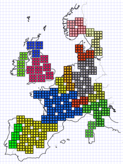
When I look at this
I am a bit "confused". You board ALREADY has a square grid patter. And yet you ADD a "second" (2nd) layer to make it more confusing?!
Could you not use the base GRID and clean up this "board"???
The Grid-on-grid looks BUSY. The smaller "chess" grids look TOO COLORFUL. Overall the image looks like "it has been 'solved'". It doesn't look RIGHT as a "starting" board (Empty). If this was the intention, well then it looks busy...
However IF this was the "starting" state board (beginning of the game), I would immediately tell you that the colors used are too vibrant and there should only be one (1) Grid pattern.
You've probably got some work cut out for you... Because IMHO this is too much!