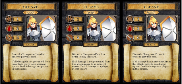
The Crosshair is Target.
The Blood Drop is Damage.
The Bow and Sword are Range.
Which Range icon is the best? The Bow or the Sword? If the Sword, which Sword?

| Finally returned after all these years (1) by DyminoMonsters2004 |
| PoA — Major shift back closer to FCE (0) by questccg |
| State of the let-off Union - November 2024 (0) by let-off studios |
| Shoppe: The Simulation of Guilds (1) by questccg |
| What “Should” Be in an RPG Design Book (10) by questccg |
| The fine line between a game and a simulation (22) by X3M |
| Only 24 hours left to bid on games for the Extra Life Charity Auction (0) by The Game Crafter |
| Songs of Conquest is now 60% off plus an additional discount for... (5) by questccg |
| Returned the reMarkable 2 and purchased the BOOX Go 10.3 (3) by questccg |
| Happy Halloween 2024 (0) by questccg |
| Epic Metal Monster Coins - Now on Kickstarter - Created by The Game Crafter (0) by The Game Crafter | |
| DuelBotz: Sample New Card (12) by questccg |
| 2 levels for an unit (wargames) (6) by X3M |
| Board Game Blueprint - New Episode Every Wednesday (17) by The Game Crafter |
| Dragon Spark Playthrough (0) by The Game Crafter |
| New Board Game Pieces - Premium Water Droplet & Premium Blood Droplet (0) by The Game Crafter |
| Designer with an 'almost' ready product (18) by questccg |
| Protospiel Madison - Only 17 Days Away! (0) by The Game Crafter |
| New Board Game Pieces - Premium Milk Bottle & Premium Beer Mug (0) by The Game Crafter |
| Testing chat GPT for mechanics searching (6) by larienna | |
| Build your own [insert game genre here] (0) by larienna |
| Epic Metal Monster Coins - Coming soon to Kickstarter - Need your feedback! (2) by questccg |
| Version 1.28 of nanDECK is available for download (0) by nand | |
| I bought a reMarkable 2 as my 50th B-Day Gift (4) by questccg |
| How do you know if a game idea/project is obsolete? (5) by larienna |
Comments
I LIKE IT!
The Bow and Sword #1.
But I figure you could use a BRIGHTER "Outline" around the icons. Don't worry if it's too "bright" you want to attract the player's eyes to that area anyways...
So I would make the outline around the icons MORE visible.
I still think the "Double Action" Banner is "extraneous" (And I would remove it). But the Ability button just below is ok. Use that space to make the illustration bigger and use the space below the title ("Cleave") better.
But I think this version is looking MUCH better...
Note: When I said I like the Bow and Sword #1, what I mean is Ranged cards should use the Bow and Melee cards should use Sword #1...