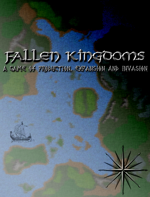
Here are some modification to the first cover.
First, I tried adding some black and white clip art. It is not the final selection of clip art, it is just to give an idea of how it look. Else the only other thing I thought is to add longitude lines.
Second, I changed the background texture for light gray instead of yellow. I makes the water more blue than in the previous version.
Third, I added a gradient with a burn filter over the map, so that one side of the map gets darker to represent the concept of decay.
The burn effect seem to work better when there was a yellow background but there was a larger "black only" area.
I will need to change the subtitle of the game since it is not very hot and I might find a better clip art selection.
What do you think?


Comments
Good additions, needs polishing
I think if what you are trying to achieve is a background map, then the color could be skipped (they were no colored maps at that time). Have you tried sepia coloring? it looks like papyrus.
I don't quite see a "burn" effect on the top right corner, I see more like a "shadow" effect. Maybe because that blue bay you have there can be seen much deeper than the rest of the coast. I don't think a burn would circumvale (¿?) the bay.