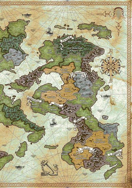
Hey guys! I guess the title says it all... I had the map professionally designed and it's almost done now. I would appreciate any constructive criticism from your side and I wouldn't mind if you have a couple of words of praise either. The game itself has similar mechanics to risk, but has lots of different features: 6 different well balanced military units from early medieval period, combining resources to train units, significant impact of terrain type on combat and unit movement, different combat system, fortifications and concept of siege...
Anyway, I'd like to hear your remarks and suggestions while the map is still in development phase.
Thanks in advance!


Comments
Thanks for the advice...
... however, I'm under the impression that I missed to explain some additional details regarding the map.
It is actually intended to be the board for the game itself. The game is played on the continental areas and sea details have very little significance apart from aesthetics. You are probably right about the sharks but my initial intention was not to focus on the authenticity of the map but to provide clear symbolic presentation of the elements which are significant for gameplay and add some decorative details (such as shark vectors) to fill in the rest of the map. So you might say that the entire map design style focuses more on symbolism than on authenticity. Also the period I mentioned is not quite that important because the game is not taking place in actual period of our history, but in an imaginary world setting where it is not quite necessary to apply the same rules as it would be if it was a historical setting. Borderlines are required because the gameplay is based on occupation of territories and the map has to be divided into smaller particles. Maybe there is a more ellegant way to achieve that but I couldn't think of any. Your remark to switch the compass and the anchor sounds as a very good suggestion, it definitely might look better that way... Thanks for the suggestions provided!!
Good work
First, I agree about sharks. Change them to some different looking sea monsters with strange names. Also ships would look better if they could be bigger and look different than other. Also suggestion about changing places of compass and anchor is good.
Second, the land. Actually I haven't got any critisism for land design. I consider it both great looking and very understandable in its simplicity. It resembles little bit of Axis & Allies map by its simplicity and area-division, but it is actually even better because of clear symbols and colours which both fit into the theme of the map. So it's great work! :)
I also got couple of questions. First, sharks were not symbols for gamplay but only decoration? In that case I think the great different looking seamonsters are better option. But if they were gameplay symbols I recommend you to change them to fit better into the map's style.
What also bothered me was transporting units from one island to another. How do you do that, or do you do that? Is there any specific routes for transporting troops? I couldn't find those form the map? If there are some, or if there are some sea-areas, they should be more clear.
Hope you understood my points, though my grammar is not the best. :D In overall rating in the scale from 0 to 10, where 0 is the worst and 10 is the best, I would rate your map somewhere between 8 and 9. :) Especially liked the simple, nice-looking and first of all easily understandable design of land areas. Keep up your good work. :)
Best regards
Kalmari Krapula
Some comments
Estethically great, but...
I would change the shark figures, they look too technical and too alike. There was no copy/paste at the time. Put monsters instead (giant serpent or squid) and a face blowing wind, with a name for it like Draconis, or Tropicalis, or some god name related.
Name some other geographical landmarks just to be fancy, preferably in the sea so they won't confuse the players (the bay of blood, sharkteeth reef or doom channel).
Switch places between the anchor and the compass.
The background lines, in actual maps, where suppose to mean something (the direct path from one point to another). You placed so many (and mirrored!) that there is no mystery they make no sense.
Regular borders came way after early medieval.
I like the colors chosen and the land borders. Hope it prints right.
Keep thinking!
yummy
This is REALLY nice. I don't have a problem with the lines - since there are no obvious 'sea lanes' I don't think they detract at all. I agree with switching the anchor and compass. I'm ambivalent about the sharks - but it would DEFINITELY look cooler with different monsters.
What I want to know is - can the artist make any changes? Is the piece set in stone? If so, then nothing we suggest is going to mean anything. If alterations can be made, I definitely want to know more about the game because I have some serious suggestions that I think will make a huge difference in the presentation.
Let us know.