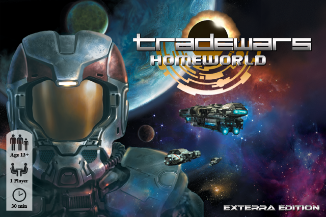
Adjusted the gradient and fixed the "T" to look more like a natural "T". I also moved down the other subtitle, so that there is more space. I tried it with the bands, but they looked awful, so I removed them (and the chevron).
@Soulfinger: you pointed out that the subtitle font might look a little bit out of place...
I added a shadow to the logo ("Tradewars") so that it pops up from the detail below it...
Again comments/feedback welcome.


