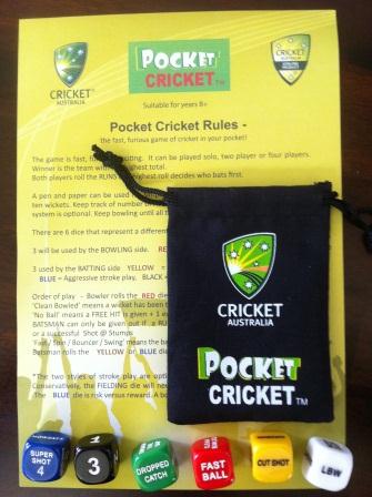
Pre production samples for the 12/13 summer

| How to design and balance a Rock-Paper-Scissor like mechanism (29) by questccg |
| End of Year Playtest Event at The Game Crafter (0) by The Game Crafter |
| New Board Game Pieces: 13mm Wood Cubes (0) by The Game Crafter |
| DuelBotz: Sample New Card (13) by questccg |
| Board Game Blueprint - New Episode Every Wednesday (24) by The Game Crafter |
| Madison Game Design Cabal (0) by The Game Crafter | |
| PoA — Major shift back closer to FCE (13) by questccg |
| Voting Begins for "VHS Case Challenge" at The Game Crafter (0) by The Game Crafter |
| New Product: Large Quad-Fold Game Boards (0) by The Game Crafter | |
| 2025 New Year Sale at The Game Crafter (0) by The Game Crafter |
| New Board Game Design Contest: ZSA Cards Challenge (0) by The Game Crafter |
| Black Friday Sale Ends Tonight (0) by The Game Crafter |
| The Shadow Of The Nokizaru Update! (0) by Jacob |
| Build your own [insert game genre here] (11) by questccg | |
| Black Friday Sale at The Game Crafter (0) by The Game Crafter |
| Power Creep, a Dungeon Pages adventure (0) by jasongreeno |
| Premium Bullet & Premium Toxic Waste Board Game Pieces at The Game Crafter (0) by The Game Crafter |
| What “Should” Be in an RPG Design Book (11) by lewpuls |
| Blank Poker Card Sale - 3 Cents Each! (0) by The Game Crafter | |
| Blank Playing Cards - Bridge 57mm x 89mm UK (1) by questccg |
| Finally returned after all these years (1) by DyminoMonsters2004 |
| State of the let-off Union - November 2024 (0) by let-off studios |
| Shoppe: The Simulation of Guilds (1) by questccg |
| The fine line between a game and a simulation (22) by X3M |
| Only 24 hours left to bid on games for the Extra Life Charity Auction (0) by The Game Crafter |
Comments
I like it
The dice pouch is very snappy and attention grabbing - just the thing to catch a watchers eye . The colour on black has real impact. I like how you have used the colours in the Cricket Australia Logo in the rules as well, it ties everything together nicely.
I'm not sure about the Pocket Cricket Title though (on the rules). On the bag it leaps out, but on the rules it blends with the green and the red doesnt have anywhere near as much impact as the white - it looks a little lost.
A black outline around the TM might lift it a little while preserving the background of the pitch which gives a feel of the grass so to speak. It would also tie the TM in with the black text in the rules themselves.
A thin black border to the pitch as well?
Not fully sure about that one though, it may be to much. Replicating the drop down shading of the badges might work better or maybe even a white border?