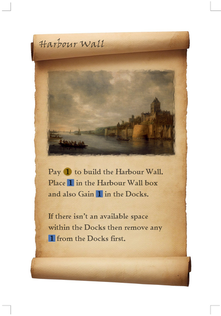
After quite a bit of recent play-testing (thankfully got a few different groups of people around the world to give the game a go) quite a few of the cards need redoing (mostly just clarification/expansion of the card text). So I'm thinking is it worth rolling out a new card design, mostly just because I'm bored of the current design lol.
The current design can be seen at http://boardgamegeek.com/image/518538, whilst this image is the proposed new design.
What do people think, stick with the old, or go with the new?
Thanks
Andy


Comments
I like it BUT
Hi - I like it BUT one problem - you misspelled Harbor. there is no "U" in it.
RDR
Solomon's Thoughts, INC.
I think you'll find...
..that it is you who is mis-spelling it ;)
Well, english spelling is
Well, english spelling is harbour, whilst the americans, etc, drop the u, like they do from colour, honour, etc.
Preeeeehttty!
(that is all) ;-)
-Matt
p.s. I like the more colorful, parchment/scroll look better ... but I liked the more detailed token graphics better from the older cards. (I guess that wasn't "all".)
These are nice!
But I liked your old cards with the woodcuts more.
Keep us informed!
You'll be glad to hear..
...that for the time being I'm going to stick with the existing designs. I need to update around 5 or 6 cards, and really need to stick with the existing design so that all those who have already printed out copies only need to print the updated cards and not a whole new set.
In a few months time when I'm happy that I've got a final set of cards I'll think about redesigns again.
Thanks!
I'm just trying to brighten the cards up a little. The woodcuts are fine, but the are a bit dull, being monochrome. So this was an attempt to brighten the cards up. What I may do is leave the guild cards as wood-cuts, but have the action/building cards have oil paintings. The scroll may be a bit OTT, but I have a simpler parchment background, that's still a bit more interesting/colourful than the original card backgrounds.
The game is progressing well. I've got loads of good feedback from various play tests (both from sessions I have attended to people all over the world who've downloaded the game from BGG or my site). I have a few minor updates to make in the next week or two and then (to use computer terminology) I think we'll be at Release Candidate stage.