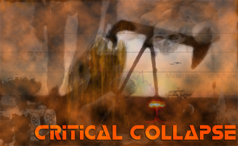
The idea is an apocalyptic theme, at least thats the mood I would like to get across.

| Happy New Year!!! (1) by questccg |
| Designing from a personal pool of mechanism (5) by questccg |
| How to design and balance a Rock-Paper-Scissor like mechanism (44) by X3M | |
| Monster Keep — Retiring this Design (0) by questccg |
| Build your own [insert game genre here] (13) by larienna | |
| Finalists Selected for the VHS Case Challenge (5) by larienna |
| DuelBotz: Sample New Card (18) by questccg | |
| 2025 New Year Sale at The Game Crafter (0) by The Game Crafter |
| Merry Christmas 2024! (0) by questccg |
| Winner Announced for "That Cool Stock Part Challenge" (0) by The Game Crafter |
| End of Year Playtest Event at The Game Crafter (0) by The Game Crafter |
| New Board Game Pieces: 13mm Wood Cubes (0) by The Game Crafter |
| Board Game Blueprint - New Episode Every Wednesday (24) by The Game Crafter |
| Madison Game Design Cabal (0) by The Game Crafter | |
| PoA — Major shift back closer to FCE (13) by questccg |
| Voting Begins for "VHS Case Challenge" at The Game Crafter (0) by The Game Crafter |
| New Product: Large Quad-Fold Game Boards (0) by The Game Crafter | |
| 2025 New Year Sale at The Game Crafter (0) by The Game Crafter |
| New Board Game Design Contest: ZSA Cards Challenge (0) by The Game Crafter |
| Black Friday Sale Ends Tonight (0) by The Game Crafter |
| The Shadow Of The Nokizaru Update! (0) by Jacob |
| Black Friday Sale at The Game Crafter (0) by The Game Crafter |
| Power Creep, a Dungeon Pages adventure (0) by jasongreeno |
| Premium Bullet & Premium Toxic Waste Board Game Pieces at The Game Crafter (0) by The Game Crafter |
| What “Should” Be in an RPG Design Book (11) by lewpuls |
Comments
Beautiful work, but I have to agree.
It's not eye-catching. I love this, and if you have anywhere else you can put it you should do so. Rulebook cover, box back, anything. It's a great piece of work, and captures the apocalypse nicely. I'd like to see it on the front of a box, but it really won't be visible in a display, so you probably should go for more bright colors on the actual cover.
Marketing Standpoint
(Note that I'm arguing not from an artist view, but from a marketing view, i mean no disrespect on my post.)
From a marketing stand point the box isnt gonna catch the eye of the consumer, you will need a more clear and crisp picture and idea of the game, the color is to monochromatic, you need a better color palette to hold the interest of a consumer to even pick up the box and look at it more. Red is a good eye catcher, maybe a red plummeting line graph and people in a panic with a blue backdrop would sell better.
The other problem i see is that your game box looks very depressing, which fits with the theme, but people dont want to buy a depressing looking game. Consider the game Fallout 3, the game is a post-apocalyptic theme, but look at the box or image, you have a pip-boy (the cartoonic character) that is smiling, the colors are a bit dull but the nuclear explosions are contracting the background, being the eye catcher. Fallout 3 shares the same theme as your game, to a degree.
I happen to love this version
I happen to love this version of the box the best from a visual stand point. It apeals to my eye and the way I like art. I don't like crisp detail, but vague impressions of visual content that build up a mood or feeling. Re-arrangement of content and a little tweaking of layout is probably necessary to create just the right feeling for the theme and audience. You know, many people may not appreciate this box idea for whatever reason or whatever they're tastes may be, but I have to give you props for this because I value it's artistic value vary much. I would eat up games that had this kind of art on them. I am a visual artist though more than a gamer.
It's a complex game, and
It's a complex game, and complexity and details go hand in hand.
So, to tempt and to draw in to the box the type of gamer who might be most likely to find your game interesting, when played, consider using the box to showcase more details, rather than use the obscurity approach. Not necessarily details from the game, itself, but various things that reflect the complexity of life's issues that the game deals with.
Even if you have generic nations in the game, you can still use real world weapons systems, as one example, to grab the eye. Some fabricated newspaper headlines could be used to mimic economic appeal, for example - or pretty much any non-military aspect. Maps and map details are often interesting. Maybe a collage, type, approach, although more orderly for the box's sake.
Thumbs down. Most of the box
Thumbs down. Most of the box looks obscured. i think that more would look at the box and say, "What the Hell is it supposed to be, anyway?"
A more colorful box would catch the person's eye quicker, I think, and hold their attention longer.
Just an idea
My wife said nearly the same thing, I was just toying with a concept.
Keep graphic, increase text readability?
What if you keep the graphics, but change the font to "warning sign" yellow with a black outline?