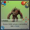
I am getting closer to a design that I am happy with (for the most part). It includes all information needed for the unit. In the future the Tile might be a tad bigger and the Attack and Defense icos will be shrunk. Also the big number for the cost of the unit will most likely be removed.
Here the differences are...
The addition of the Galaxy, Planet, Genration and tile number. The only thing missing here is the Race of the unit.
A more muted background.
Updated unit cost icon.
- The big number shows the total resources needed while the three smaller numbers associated with a color shows how much of each resource is needed.
Name location and design.
*These tiles are simply for PnP versions and prototype testing - nothing is set in stone.


