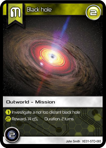
Okay so "Ed Wedig" has been helping me out to try to refine the look of the cards (layout). So far, I am very pleased with how the card is coming along.
One major change was the use of more appropriate fonts by Ed. There still need to be some minor corrections (to a couple fonts) but I think there is a big difference.
Also instead of silver on the bottom potion, I went with a hex grid (as per one designer's suggestions) following Ed with his hex bullets. I added a computer circuit to the background and feel the look is very SCI-FI-ish!
I also gave the flag a "Satin Texture" to make it look nicer than just a *flat* colour.
I will post an update with the more final version when I have it...
Thank you for your comments and suggestions.


Comments
Update
I have made corrections to the fonts (for sizing restrictions) in addition to some minor adjustments...
I have also remove the Starship class restriction form the "Mission" cards. So there is more room where the card text is located. Two rows of writing should be sufficient for all the different types of cards.