Skip to Content
 

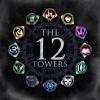
Box art design (The 12 Towers)

4 replies [Last post]
CrosswindsGaming
CrosswindsGaming's picture
Offline
Joined: 06/11/2017
logo resize.jpg

Hello again, over the course of about a day and a half, I came up with this design. I took a different direction than my usual style, and went for a darker, more gritty and war torn logo/box art.

While it's not top professional work, I'm liking this one so far and I might have it printed for a test box. Any input and criticism is welcome!

questccg
questccg's picture
Offline
Joined: 04/16/2011
Looks pretty good!

I like it. Simple but self-explanatory and true to the identity of your game (12 Towers)...

joebergmann
joebergmann's picture
Offline
Joined: 12/29/2016
Very nice!

I can't wait to see more!

X3M
X3M's picture
Offline
Joined: 10/28/2013
Imho

Simplicity is often the best for a box cover. Yours looks good by my standards.

Mosker
Mosker's picture
Offline
Joined: 03/30/2014
As a test box, it's fine. Question about the darkness:

In the lighter versions, did one get a better idea of height, of towers, that we might be seeing this from stylized overhead view? The word "tower" is so evocative, I think Tolkein, Rapunzel, the World Trade Center, and a host of utopian and dystopian (and the mix) works.

Syndicate content


forum | by Dr. Radut