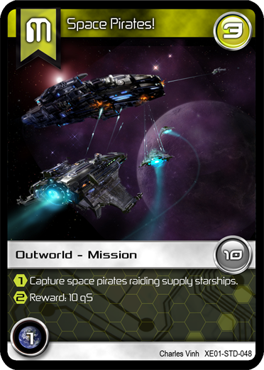
When you print off/try a new PNP, how much art do you like to have? How polished do you like the graphic design to be?
I ask because my team is kicking around the idea of releasing at least two PNPs over time.
(1) A B&W version that has good graphic design for important cards & clip/free art.
After gaining some popularity (a certain number of downloads or Facebook/Twitter followers?), we'd humble-Kickstart (< 3K) custom art and more graphic design.
PNP #2 would use this custom art & graphic design.
Do you think this is a good idea? What makes a PNP look polished to you?


OK, good to know. I wasn't sure if people would judge lo-fi too harshly. Am I correct to interpret that so long as the PNP's rules are clear/coherent and the art style is consistent, you'll be happy?
And I'm glad you think the two phased PNP development is a good idea.