Skip to Content
 

Would you critique my artwork?

15 replies [Last post]
BenMora
BenMora's picture
Offline
Joined: 02/13/2012
Wages of War board art WIP
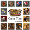
Wages of War tiles

I am now working on the art for my upcoming game, "Wages of War: The Uncooperative Siege Game"
You can learn about it here: http://signup.moragames.com/

What do you think of this artwork? See attached.

Keep in mind, this game is a very generic "medieval" theme. No characters in this game, and no specific historical reference to time, place, etc. It could be considered more of a "eurogame" in that the theme is not heavy. But feel free to point out anything that you think might be wrong with this castle, or if you have suggestions on how to improve it. :)
Thanks!
-Ben Mora
Mora Games

ElKobold
ElKobold's picture
Offline
Joined: 04/10/2015
Looks great. Gives this

Looks great. Gives this Stronghold/Age of empires vibe.

TwentyPercent
Offline
Joined: 12/25/2012
Looks great

Agreed. The art looks great; better than art on many published games I've seen.

Nice job.

ErnstFourie
ErnstFourie's picture
Offline
Joined: 06/18/2014
very AoE

I love the AoE feel. Looks good

BenMora
BenMora's picture
Offline
Joined: 02/13/2012
ElKobold wrote:Looks great.

ElKobold wrote:
Looks great. Gives this Stronghold/Age of empires vibe.
ErnstFourie wrote:
I love the AoE feel. Looks good

I'm actually SUPER EXCITED that you both made that connection! I was kind inspired a little bit by the idea of isometric and slightly unrealistically compact architecture that is common of RTS games, especially AoE!

Rimmsolin
Rimmsolin's picture
Offline
Joined: 12/13/2013
Really enjoy the castle.

Really enjoy the castle. Looks compact and appealing to own it!

One thought on the bow, axe and sword tiles is to watch the contrast between foreground and background elements. The bow on top of the leather is nearly the same if you took it to grayscale (and even has similar color.) In addition the dark shadows makes them blend even more. Consider increasing the contrast (use a light background) or at least replace the black outline to a light glow to help pop the foreground and make it instantly readable.

Chances are when it goes to print it will darken and blend together. Also reflective coating or even heavy linen finish on the physical tiles can make the art harder to read.

The other tiles are pretty readable.

ElKobold
ElKobold's picture
Offline
Joined: 04/10/2015
Oh, oh, one more grain of

Oh, oh, one more grain of salt (sorry :)

This is crappy "LARP" chainmail "wannabe":
http://pad3.whstatic.com/images/thumb/0/03/Chainmail1.jpg/728px-Chainmai...

This is the actual chainmail:
https://www.google.com/search?q=chainmail&espv=2&biw=1536&bih=729&site=w...

Willem Verheij
Willem Verheij's picture
Offline
Joined: 06/08/2016
The art work looks very good

The art work looks very good to me.

My only concern is if those shields represent different players, that the first two might need to be a bit more different. Its always good to be able to distinguish player markers at a quick glance.

But if they arent for that purpose, then it should be fine.

BenMora
BenMora's picture
Offline
Joined: 02/13/2012
Rimmsolin wrote:Really enjoy

Rimmsolin wrote:
Really enjoy the castle. Looks compact and appealing to own it!

One thought on the bow, axe and sword tiles is to watch the contrast between foreground and background elements. The bow on top of the leather is nearly the same if you took it to grayscale (and even has similar color.) In addition the dark shadows makes them blend even more. Consider increasing the contrast (use a light background) or at least replace the black outline to a light glow to help pop the foreground and make it instantly readable.

Chances are when it goes to print it will darken and blend together. Also reflective coating or even heavy linen finish on the physical tiles can make the art harder to read.

The other tiles are pretty readable.


Thanks for the feedback. I'll see what I can do to improve the contrast. Good point.

ElKobold wrote:
Oh, oh, one more grain of salt (sorry :)

This is crappy "LARP" chainmail "wannabe":
http://pad3.whstatic.com/images/thumb/0/03/Chainmail1.jpg/728px-Chainmai...

This is the actual chainmail:
https://www.google.com/search?q=chainmail&espv=2&biw=1536&bih=729&site=webhp&source=lnms&tbm=isch&sa=X&ved=0ahUKEwjtlfaS55rOAhWBK5oKHfhjAh0Q_AUIBigB#tbm=isch&q=riveted+chainmail


That shows how much I know. I saw those and assumed THEY were the more modern version. Looked like a whole bunch of key-rings. I'll consider this. Being on small tiles (they'll end up 1.25") it might not be worth the effort, but I'll consider it.

Willem Verheij wrote:
The art work looks very good to me.

My only concern is if those shields represent different players, that the first two might need to be a bit more different. Its always good to be able to distinguish player markers at a quick glance.

But if they arent for that purpose, then it should be fine.


I didn't clarify, but the shield tiles will be randomly drawn from a bag to represent the strength of the enemy. 1 tile gets drawn for each wall of the castle. The number of "fluer de lis" icons represents the strength as well as the VP value when destroyed. The "5VP" banner tiles are placed in the Keep of the castle, rewarded as a bonus for a successful attack that pushes past the walls.

Thank you all for your feedback!

Midnight_Carnival
Midnight_Carnival's picture
Offline
Joined: 06/17/2015
Hey BenMora. Among my friends

Hey BenMora.
Among my friends there are professional illustrators and others far more accomplished than myself, I am frequently asked for criticism because no matter how impressed I am with something I will always make some suggestion at least as to how things could be done differently even if I can not make any kind of criticism. As a writer, I know how frustrating it is when you ask for critique and all you get is "hey man you stuff is awesome XD", however in the case of the artwork you have presented BenMora, after making a close examination and detaching myself from my initial reaction I can say that in this particular instance I can find no technical points I could raise which I feel could significantly improve the quality of your work and no suggestions I could make which I feel would offer anything other than inferior alternatives to the work you have created.
I am not saying "hey man, that's awesome, you rock" because I am being too lazy to suggest anything else, I am simply saying that whatever you do, however you do it, I would recommend that you continue to do it as you do.
Further, if you are not already employed as an illustrator or graphic designer I would suggest that you consider these career options.
thank you.

Masacroso
Offline
Joined: 05/05/2014
It seem very fine and very

It seem very fine and very neutral. What I want to say by "neutral" is that the illustration dont make you thing about: this game is gore? this game is gothic? Etc.

But I would change the background of the images, making them more transparent or with more contrast (in color or shadows), so you can see more clearly the essential symbol. I think this will be a very good functional change.

To me a game must be symbolically more functional than artistic.

radioactivemouse
radioactivemouse's picture
Offline
Joined: 07/08/2013
The only thing...

The only thing I tend to see is problems with contrast. The bow and arrows with the background make it hard to decipher at farther distances and the shield border can meld with the brick in the background. I know you used a drop shadow/outer glow to pull out the icons, but I think if you just lighten/darken some of the colors so that there's more contrast, I think that would work out better...visually speaking.

The blue and red shields (non circle) have this shadow that doesn't need to be there when you have the drop shadow. Again, it's more of a clarity issue since the shields tend to force your eye down to the bottom.

Just my observation.

questccg
questccg's picture
Offline
Joined: 04/16/2011
Not enough information! :P

Hi Ben,

I really like the artwork; looks good. If there was only one piece of "advice" or "critique" that I would have is this:

-Man you should blog more often!

I visited your site hoping to get more details on the game - but sadly there were no more to be had! :(

You should try to "maybe" post one (1) blog entry per month... Talking about what's going on with the game. I must admit the "worker selection/role placement" makes me curious how playing this game will unfold.

Don't forget you can keep control over your game by not making the rules available for public consumption - but sharing more details would be great too!

Keep up the great work!

Rick L
Rick L's picture
Offline
Joined: 08/22/2016
cardboard edison finalist

I just saw your video on the cardboard edison finalist page - congrats on getting there! I didn't see any threads about the video, but it kind of goes along with the art topic of this thread.

How did you do the intro to the video? Looks a lot like Tabletopia, but no cursors, and very smooth and refined cgi rendition of the game.

BenMora
BenMora's picture
Offline
Joined: 02/13/2012
Hi everyone! I am terribly

Hi everyone! I am terribly sorry, I never got notifications (I better check on that) that anyone had continued to reply to this thread. Thank you all so much for the feedback!

BenMora
BenMora's picture
Offline
Joined: 02/13/2012
Rick L wrote:I just saw your

Rick L wrote:
I just saw your video on the cardboard edison finalist page - congrats on getting there! I didn't see any threads about the video, but it kind of goes along with the art topic of this thread.

How did you do the intro to the video? Looks a lot like Tabletopia, but no cursors, and very smooth and refined cgi rendition of the game.


Thanks so much! I am juggling a lot and am trying to be more proactive about these things.
I did the video using Blender (a free 3D program that is better than Lightwave or Maya imho that I had paid tons of money for in the past) and got my friend Andy Barnett who is a professional voice actor to do the narration. I did all of the editing and stuff myself. It was a lot of fun. I've entertained the thought of doing that as a service for other people's games. :)
For those who want to see the video AND/or enter to win a copy of the game, visit signup.moragames.com
It's coming to Kickstarter on April 11th! :)

Syndicate content


forum | by Dr. Radut