Home » AV Card 2
User login
Feb 11 2025
| Why a SpaceGame (part 2) (37) by X3M | |
| Prospector — I decided to have a dedicated BLOG for this "Expansion" (32) by questccg |
Feb 9 2025
| Dead Steam - Post Apocalyptic train building card game (38) by Tbone |
Feb 6 2025
| Board Game Blueprint - New Episode Every Wednesday (32) by The Game Crafter |
Feb 1 2025
| Tabletop Game Jobs (0) by The Game Crafter |
Jan 31 2025
| Protospiel Cleveland (0) by The Game Crafter |
Jan 30 2025
| "Never Seven" - Playtest Rules - Suspended While the Game is Undergoing Modification (7) by Steve |
Jan 27 2025
| New Board Game Pieces - Premium Mushroom & Premium Brown Mushroom (0) by The Game Crafter | |
| Weight of sorting (4) by X3M |
Jan 23 2025
| Placing cards (planets) in specific positions (orbits) (4) by Tbone | |
| Designing from a personal pool of mechanism (36) by larienna |
Jan 21 2025
| New Board Game Pieces - InFUNity Tiles (Hat Shape) (0) by The Game Crafter |
Jan 14 2025
| New Auction: 1 Month of Advertising on FatherGeek.com (0) by The Game Crafter |
Jan 11 2025
| DuelBotz: Sample New Card (19) by questccg |
Jan 8 2025
| Comparing 2 new dice replace mechanics (2) by X3M |
Jan 1 2025
| Happy New Year!!! (1) by questccg |
Dec 29 2024
| How to design and balance a Rock-Paper-Scissor like mechanism (44) by X3M | |
| Monster Keep — Retiring this Design (0) by questccg |
Dec 27 2024
| Build your own [insert game genre here] (13) by larienna | |
| Finalists Selected for the VHS Case Challenge (5) by larienna |
Dec 26 2024
| 2025 New Year Sale at The Game Crafter (0) by The Game Crafter |
Dec 25 2024
| Merry Christmas 2024! (0) by questccg |
Dec 24 2024
| Winner Announced for "That Cool Stock Part Challenge" (0) by The Game Crafter |
Dec 17 2024
| End of Year Playtest Event at The Game Crafter (0) by The Game Crafter |
Dec 16 2024
| New Board Game Pieces: 13mm Wood Cubes (0) by The Game Crafter |


Comments
Nice card
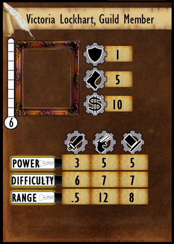
I think either card would work well, but my preference is for the second. This is based mainly on the idea that the "chart" style on the bottom seems to better separate the equipment this person carries from the traits that define them as a character. It will also save a little time to have those types of numbers at your fingertips.
The contrast is good; I found the card very easy to read. It loses a little bit in black/white printing, but would still be fine for game play.
For both cards, I would suggest lining up the outside edge of the meter bar on the left of the picture with the left edge of the power/difficulty/range; this would also shift your picture and stats to the right a little bit; just thought, not sure it would look any better. With the meter as close as it is to the edge of the card now, you might have some printing issues farther down the road.
The icons feel Victorian enough, but the sword/dagger icon felt more fantasy oriented; could it be changed to something like a rapier?
I like the overall "aged" look of the card
These look great - thanks for sharing!
Thanks!
I agree that I need to move the thermometer a bit to the right.
"the bottom seems to better separate the equipment this person carries from the traits that define them as a character." - I had trouble figuring out what you meant by that and I assume you mean the separation of the Shield, Boot, and Money Icons from the "Weapons". You made it sound better than I could possibly put it. LOL
I really didn't want to use a sword icon. My first choice was a Fist or a Gauntlet. A rapier didn't work due to the lack of black/white contrast (since the blade is so thin) and some people didn't know what it was. Of course, nothing is etched in stone and this is only so I can have a quality playing card for playtesting.
I'd like to add the name of the weapons on top of each inverse triangle of stats on the first card. Do you think that would win you over?
Also, the fault of the second card is the lack of no space for Abilities. (Of course, both cards will be double-sided to contain Abilities. The first card will either have Ability names w/ description of said abilities on back or flavor text)
Thank you so much for your input!!
If you just need the
If you just need the abilities to be keywords on the front of the card, why not move the three icons (Defense, Movement and Money) down to the bottom of the card in a single row?
Then the meter and picture could shift right a little and then you could have a box with ability keywords in it. That way the character portrait and abilities are strongly tied together and (I presume) once players have experience with the game they can probably play just off the keywords.
I do agree... change the sword to a fist. The Victorian era was one that saw a surge of interest in martial arts (though it meant something a little different than what we think of today) and the fist would be appropriate.