Home » Card Montage
User login
Mar 10 2025
| Kingdom of ... (7) by questccg |
Mar 9 2025
| PoA — Major shift back closer to FCE (17) by questccg |
Mar 8 2025
| Solo racing game: Stunt racing (5) by larienna |
Mar 7 2025
| Some thoughts about heavy euro games (22) by questccg |
Mar 2 2025
| Why a SpaceGame (part 2) (47) by X3M |
Feb 27 2025
| Selling Your Games on The Game Crafter (Hosted by Pam Walls) (0) by The Game Crafter |
Feb 26 2025
| Anyone have any marking recommendations? (2) by questccg |
Feb 23 2025
| Looking for some EURO abilities (2) by questccg | |
| Board Game Blueprint - New Episode Every Wednesday (34) by The Game Crafter |
Feb 21 2025
| Epic Metal Monster Coin Update (1) by questccg |
Feb 13 2025
| Blank Poker Card Sale - Only 3 Cents Each! (0) by The Game Crafter |
Feb 12 2025
| 2025 Unpub Mentorship Program (0) by The Game Crafter |
Feb 11 2025
| Prospector — I decided to have a dedicated BLOG for this "Expansion" (32) by questccg |
Feb 9 2025
| Dead Steam - Post Apocalyptic train building card game (38) by Tbone |
Feb 1 2025
| Tabletop Game Jobs (0) by The Game Crafter |
Jan 31 2025
| Protospiel Cleveland (0) by The Game Crafter |
Jan 30 2025
| "Never Seven" - Playtest Rules - Suspended While the Game is Undergoing Modification (7) by Steve |
Jan 27 2025
| New Board Game Pieces - Premium Mushroom & Premium Brown Mushroom (0) by The Game Crafter | |
| Weight of sorting (4) by X3M |
Jan 23 2025
| Placing cards (planets) in specific positions (orbits) (4) by Tbone | |
| Designing from a personal pool of mechanism (36) by larienna |
Jan 21 2025
| New Board Game Pieces - InFUNity Tiles (Hat Shape) (0) by The Game Crafter |
Jan 14 2025
| New Auction: 1 Month of Advertising on FatherGeek.com (0) by The Game Crafter |
Jan 11 2025
| DuelBotz: Sample New Card (19) by questccg |
Jan 8 2025
| Comparing 2 new dice replace mechanics (2) by X3M |


Comments
Seems like you want your cards...
To be SQUARE? That's not an option at "The Game Crafter" (TGC). Might be difficult to get a prototype made with "square corners"...
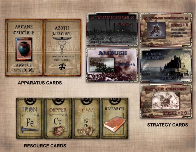
Your "Resource" and "Apparatus" cards look okay (aside from being square).
But your "Strategy" cards are very hard to read. You are using RED on Black, RED on Brown, BLUE on Black, etc. all these combinations make it HARD to read the text on the cards themselves. You're even using GREY on Grey and BLUE on Blue!
Those color combinations make it DIFFICULT to read your "Strategy" cards. Maybe instead of "Blue, Red, Grey" you use WHITE. And find ONE (1) color for the title of the cards... all those colors are difficult to read and maybe one color would make the cards look more "uniform" (Just a suggestion...)
Cheers Mate!
Another point: When I first SAW the card, I read: "Vampiric HORSE". And then I was searching the picture for the HORSE - and could find none! LOL :) That's what happens when you use strange colors and mix them in with the background, making them hard to read...
The square corner cards work
The square corner cards work for Tabletopia, but I've resized them with extended "bleed" borders for my game Crafter files - those will have rounded corners.
The Strategy cards kind of need to have different colored text to help players easily tell the difference between Strike cards (red), Defense cards (blue), and Reinforcement cards (grey). Even though most of the cards have a label, it still helps to have a visual cue from the color of the card borders and text.
I'm going to think it over more before I send anything to print. I agree, some text is difficult to read though.