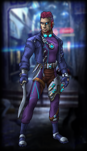
Home » Nightlancer Assassin
User login
Feb 1 2025
| Tabletop Game Jobs (0) by The Game Crafter |
Jan 31 2025
| Protospiel Cleveland (0) by The Game Crafter | |
| Why a SpaceGame (part 2) (27) by X3M |
Jan 30 2025
| "Never Seven" - Playtest Rules - Suspended While the Game is Undergoing Modification (7) by Steve |
Jan 27 2025
| New Board Game Pieces - Premium Mushroom & Premium Brown Mushroom (0) by The Game Crafter | |
| Weight of sorting (4) by X3M |
Jan 25 2025
| Dead Steam - Post Apocalyptic train building card game (20) by questccg |
Jan 23 2025
| Placing cards (planets) in specific positions (orbits) (4) by Tbone | |
| Designing from a personal pool of mechanism (36) by larienna |
Jan 21 2025
| New Board Game Pieces - InFUNity Tiles (Hat Shape) (0) by The Game Crafter |
Jan 14 2025
| New Auction: 1 Month of Advertising on FatherGeek.com (0) by The Game Crafter |
Jan 11 2025
| DuelBotz: Sample New Card (19) by questccg |
Jan 8 2025
| Comparing 2 new dice replace mechanics (2) by X3M |
Jan 1 2025
| Happy New Year!!! (1) by questccg |
Dec 29 2024
| How to design and balance a Rock-Paper-Scissor like mechanism (44) by X3M | |
| Monster Keep — Retiring this Design (0) by questccg |
Dec 27 2024
| Build your own [insert game genre here] (13) by larienna | |
| Finalists Selected for the VHS Case Challenge (5) by larienna |
Dec 26 2024
| 2025 New Year Sale at The Game Crafter (0) by The Game Crafter |
Dec 25 2024
| Merry Christmas 2024! (0) by questccg |
Dec 24 2024
| Winner Announced for "That Cool Stock Part Challenge" (0) by The Game Crafter |
Dec 17 2024
| End of Year Playtest Event at The Game Crafter (0) by The Game Crafter |
Dec 16 2024
| New Board Game Pieces: 13mm Wood Cubes (0) by The Game Crafter |
Dec 14 2024
| Board Game Blueprint - New Episode Every Wednesday (24) by The Game Crafter |
Dec 13 2024
| Madison Game Design Cabal (0) by The Game Crafter |


Comments
Foreground-background distinction
The artwork looks very promising and the theme is appealing, but personally I would like more contrast between foreground and background. Try reducing the image so it literally is thumbnail size, with your thumb at arms distance, and then assess the card as a whole. It is hard to make out the figure at true thumbnail size. Keeping the figure dark and crisp and letting the background go paler and with some of the contrast washed out would make the foreground/background distinction more apparent. At the moment, the artist is mostly relying on blurring the background, which I feel is not quite enough.
Of course, preferences like that are very subjective, so others may disagree.