Home » Victorian Domain
User login
Mar 10 2025
| Kingdom of ... (7) by questccg |
Mar 9 2025
| PoA — Major shift back closer to FCE (17) by questccg |
Mar 8 2025
| Solo racing game: Stunt racing (5) by larienna |
Mar 7 2025
| Some thoughts about heavy euro games (22) by questccg |
Mar 2 2025
| Why a SpaceGame (part 2) (47) by X3M |
Feb 27 2025
| Selling Your Games on The Game Crafter (Hosted by Pam Walls) (0) by The Game Crafter |
Feb 26 2025
| Anyone have any marking recommendations? (2) by questccg |
Feb 23 2025
| Looking for some EURO abilities (2) by questccg | |
| Board Game Blueprint - New Episode Every Wednesday (34) by The Game Crafter |
Feb 21 2025
| Epic Metal Monster Coin Update (1) by questccg |
Feb 13 2025
| Blank Poker Card Sale - Only 3 Cents Each! (0) by The Game Crafter |
Feb 12 2025
| 2025 Unpub Mentorship Program (0) by The Game Crafter |
Feb 11 2025
| Prospector — I decided to have a dedicated BLOG for this "Expansion" (32) by questccg |
Feb 9 2025
| Dead Steam - Post Apocalyptic train building card game (38) by Tbone |
Feb 1 2025
| Tabletop Game Jobs (0) by The Game Crafter |
Jan 31 2025
| Protospiel Cleveland (0) by The Game Crafter |
Jan 30 2025
| "Never Seven" - Playtest Rules - Suspended While the Game is Undergoing Modification (7) by Steve |
Jan 27 2025
| New Board Game Pieces - Premium Mushroom & Premium Brown Mushroom (0) by The Game Crafter | |
| Weight of sorting (4) by X3M |
Jan 23 2025
| Placing cards (planets) in specific positions (orbits) (4) by Tbone | |
| Designing from a personal pool of mechanism (36) by larienna |
Jan 21 2025
| New Board Game Pieces - InFUNity Tiles (Hat Shape) (0) by The Game Crafter |
Jan 14 2025
| New Auction: 1 Month of Advertising on FatherGeek.com (0) by The Game Crafter |
Jan 11 2025
| DuelBotz: Sample New Card (19) by questccg |
Jan 8 2025
| Comparing 2 new dice replace mechanics (2) by X3M |


Comments
new look
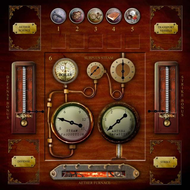
Questcg had some great advice on my previous player board design. I still need to get an artist to produce something professional for my player boards, but in the meantime, this seemed like a better look overall, so I used this in my 2nd prototype.
WOW!
That is an amazing IMPROVEMENT over version 1.0.
Might I make ONE (1) improvement to version 2.0: make the FONT COLORS BRIGHTER.
Things like "Surplus Steam", "Defense Bonus", "Strike Bonus", etc.
Perhaps make them as BRIGHT at the numbers 1-6... Because they are a bit hard to read at the present brightness.
But overall a DEFINITE improvement over the original version.
Thanks! Easy enough to fix
Thanks! Easy enough to fix those few font colors - I meant to do that a while back but completely forgot!
The four corners have place holders for upgrade cards, but I'm trying to see if I can get enough info simplified so I can just have the upgrades printed on the boards, instead of double sided cards.