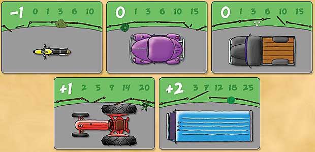
Some of the Vehicle Cards for Cow Tipping.
Copyright © 2008 Matthew Frederick

| Why a SpaceGame (part 2) (44) by X3M |
| Blank Poker Card Sale - Only 3 Cents Each! (0) by The Game Crafter |
| 2025 Unpub Mentorship Program (0) by The Game Crafter |
| Prospector — I decided to have a dedicated BLOG for this "Expansion" (32) by questccg |
| Dead Steam - Post Apocalyptic train building card game (38) by Tbone |
| Board Game Blueprint - New Episode Every Wednesday (32) by The Game Crafter |
| Tabletop Game Jobs (0) by The Game Crafter |
| Protospiel Cleveland (0) by The Game Crafter |
| "Never Seven" - Playtest Rules - Suspended While the Game is Undergoing Modification (7) by Steve |
| New Board Game Pieces - Premium Mushroom & Premium Brown Mushroom (0) by The Game Crafter | |
| Weight of sorting (4) by X3M |
| Placing cards (planets) in specific positions (orbits) (4) by Tbone | |
| Designing from a personal pool of mechanism (36) by larienna |
| New Board Game Pieces - InFUNity Tiles (Hat Shape) (0) by The Game Crafter |
| New Auction: 1 Month of Advertising on FatherGeek.com (0) by The Game Crafter |
| DuelBotz: Sample New Card (19) by questccg |
| Comparing 2 new dice replace mechanics (2) by X3M |
| Happy New Year!!! (1) by questccg |
| How to design and balance a Rock-Paper-Scissor like mechanism (44) by X3M | |
| Monster Keep — Retiring this Design (0) by questccg |
| Build your own [insert game genre here] (13) by larienna | |
| Finalists Selected for the VHS Case Challenge (5) by larienna |
| 2025 New Year Sale at The Game Crafter (0) by The Game Crafter |
| Merry Christmas 2024! (0) by questccg |
| Winner Announced for "That Cool Stock Part Challenge" (0) by The Game Crafter |
Comments
Hey Matt, Have you considered
Hey Matt,
Have you considered rendering these same type of images at 3/4 perspective (as if viewing from an angle above, rather than directly above)?
I love the style but the bus seems a little non-descript.
I don't mean to sound critical at all. I love this game and it's graphics. I think you did a GREAT job in choosing vehicles that are easily identifiable (who in the world doesn't know a VW Bug?) and instantly let us know vital game info at the same time (just how big is that sucker anyway?).
I am just wondering how the cards might look like from a different perspective.
Hey, just had another thought... if you (as a bovine, that is) "flip" the vehicle do you (the player, presumably Homo Sapiens) turn over the card and actually see the vehicle on its side (with perhaps a well placed dent from hooves or horns)?
That could be an interesting graphic addition to the game!
Anyway, I love this game... it has really got me thinking... thanks for the stimulus and very good luck with this project.
Let me know when I can place my order! (I'll take three)
J.
This is just a prototype, for
This is just a prototype, for hopefully selling the game. If I were to do graphics for a version to be published, they'd be much nicer. The 3/4 view is a great idea!
The flipped vehicle wouldn't work, unfortunately, because the back sides have to be (well, are best) identical, as it's a deck that's shuffled and unknown cards are coming out. One vehicle that looks like that would be a great graphic for the back, though.
Thanks for the great ideas! If I don't sell it, I may well self-publish, in which case I might well do just that!
Motorcycle
Looks like the motorcycle would be effective! How did you do the art? Can you divulge what programs you used? Your game looks great!
Art
I searched Google Images for pictures of vehicles from above... it was marginally useful, but had enough from heights that I got some ideas.
I then sketched them by hand on paper, very large (full sheet of paper). Played with them a fair bit, then finally drew over them in ink. Scanned them into the computer. Brought them into Photoshop and filled solid areas with color. Used Photoshop's dodge and burn tools to make lighter and darker parts with an imagined light source. Cleaned everything up.
Then shrunk them to card size. This is, as any comic/comic book illustrator will tell you, is where the magic happens: the fairly crappy-looking illustration doesn't look half bad when reduced. ;)
Looks nice, Matthew!
Looks nice, Matthew!
Thanks! :)
Thanks! :)