|

|
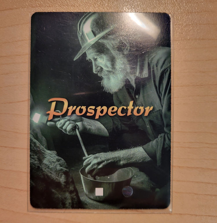
Okay so let's start with that "Cardback"... I like it a LOT. But there is one serious problem with it: TGC's Drift on borders. None of the cards appear to be "centered" and this is DUE mainly to the BORDER. And I'm not being ignorant or anything like that, TGC WARNS Designers about the potential DRIFT and how "borders" can make it seem more like cards are NOT CENTERED correctly.
I could REMOVE the BORDER (which is what a colleague told me that was the ONLY logical option) and be left with a more "professional" looking product since the drift will not be noticeable on a FULL BLEED image.
I could ADD the BORDER to a production from China (IF I ever manage to sell some games) and then we have the whole ... Why is the Chinese Version better than the USA Version?!?!
So it seems like I need to make a COMPROMIZE and REMOVE the borders from now to all eternity. Of course I HATE this... Because I really like how the border just makes the centered image "POP" and have a bit of DESIGN FLARE.
I must just be too picky...


It just looks like plain CR@P with the drifting card sample. Here have a look for yourselves:
I know the GREEN color seems a bit bad... But in person, the green looks great. It's just that DRIFT means I can't possibly SELL that! It would be a huge embarrassment ... Would you pay $25 USD for that??? I certainly would NOT! And so I seem CLEAR that Borderless is the way to go.
Of course this will APPEAR different that the actual cards from the "core" Game. But there is really nothing I can do about that. TBH ... If I ever make a Chinese version ... I could RESTORE the Border but it would SUCK to have the Borderless version (Made in the USA) and the Chinese version much better looking. IDK.
But it is what it is... It's sh!tty looking for sure!