
This is this is my current card redesign.
I am not happy with the grey block, but have yet to fully explore other options yet. It looks 100% better than just white


 | Walls? To give cover, or not to give cover? (3) by X3M |
| Kingdom of ... (12) by questccg |
 | PoA — Major shift back closer to FCE (17) by questccg |
| Solo racing game: Stunt racing (5) by larienna |
| Some thoughts about heavy euro games (22) by questccg |
| Why a SpaceGame (part 2) (47) by X3M |
| Selling Your Games on The Game Crafter (Hosted by Pam Walls) (0) by The Game Crafter |
| Anyone have any marking recommendations? (2) by questccg |
| Looking for some EURO abilities (2) by questccg |
| Board Game Blueprint - New Episode Every Wednesday (34) by The Game Crafter |
| Epic Metal Monster Coin Update (1) by questccg |
| Blank Poker Card Sale - Only 3 Cents Each! (0) by The Game Crafter |
| 2025 Unpub Mentorship Program (0) by The Game Crafter |
| Prospector — I decided to have a dedicated BLOG for this "Expansion" (32) by questccg |
| Dead Steam - Post Apocalyptic train building card game (38) by Tbone |
| Tabletop Game Jobs (0) by The Game Crafter |
| Protospiel Cleveland (0) by The Game Crafter |
| "Never Seven" - Playtest Rules - Suspended While the Game is Undergoing Modification (7) by Steve |
| New Board Game Pieces - Premium Mushroom & Premium Brown Mushroom (0) by The Game Crafter |
| Weight of sorting (4) by X3M |
| Placing cards (planets) in specific positions (orbits) (4) by Tbone |
| Designing from a personal pool of mechanism (36) by larienna |
| New Board Game Pieces - InFUNity Tiles (Hat Shape) (0) by The Game Crafter |
| New Auction: 1 Month of Advertising on FatherGeek.com (0) by The Game Crafter |
| DuelBotz: Sample New Card (19) by questccg |
Comments
That's A Lot of Information
You might try a bar down the left side of the card, rather than at the top. Unless something will be laid on top of this card after it is played, it would be easier to index with the information on the left and it will also likely allow you to print each item so that it is slightly larger.
You might also think about moving the special text below the image so that you don't obscure the most important part (the face).
I have tried it with a bar
I have tried it with a bar down the side. I guess one thing I have not shown here is that this is really showing 2 cards in one. I agree with the text and face. There are few cards that have this as an issue, and it will be addressed. The text for the above card is for a spell called Poison dagger, in this instance it was just a case of me rotating the picture until it fitted
Dungeon cards will have the rank and chevron (blue), as well as the 5 stats, but no gold value.
e.g.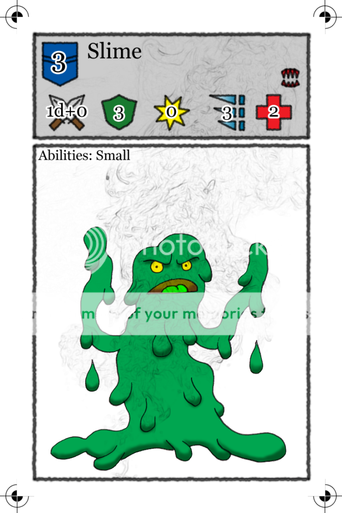
Where as Equipment cards will replace the chevron + rank value with a straight image representing the shop, add the gold cost and location where the item can be used.
Thanks for the input