Home » Daimyo Cpmparison.jpg
User login
Mar 14 2025
| Walls? To give cover, or not to give cover? (3) by X3M |
Mar 13 2025
| Kingdom of ... (12) by questccg |
Mar 9 2025
| PoA — Major shift back closer to FCE (17) by questccg |
Mar 8 2025
| Solo racing game: Stunt racing (5) by larienna |
Mar 7 2025
| Some thoughts about heavy euro games (22) by questccg |
Mar 2 2025
| Why a SpaceGame (part 2) (47) by X3M |
Feb 27 2025
| Selling Your Games on The Game Crafter (Hosted by Pam Walls) (0) by The Game Crafter |
Feb 26 2025
| Anyone have any marking recommendations? (2) by questccg |
Feb 23 2025
| Looking for some EURO abilities (2) by questccg | |
| Board Game Blueprint - New Episode Every Wednesday (34) by The Game Crafter |
Feb 21 2025
| Epic Metal Monster Coin Update (1) by questccg |
Feb 13 2025
| Blank Poker Card Sale - Only 3 Cents Each! (0) by The Game Crafter |
Feb 12 2025
| 2025 Unpub Mentorship Program (0) by The Game Crafter |
Feb 11 2025
| Prospector — I decided to have a dedicated BLOG for this "Expansion" (32) by questccg |
Feb 9 2025
| Dead Steam - Post Apocalyptic train building card game (38) by Tbone |
Feb 1 2025
| Tabletop Game Jobs (0) by The Game Crafter |
Jan 31 2025
| Protospiel Cleveland (0) by The Game Crafter |
Jan 30 2025
| "Never Seven" - Playtest Rules - Suspended While the Game is Undergoing Modification (7) by Steve |
Jan 27 2025
| New Board Game Pieces - Premium Mushroom & Premium Brown Mushroom (0) by The Game Crafter | |
| Weight of sorting (4) by X3M |
Jan 23 2025
| Placing cards (planets) in specific positions (orbits) (4) by Tbone | |
| Designing from a personal pool of mechanism (36) by larienna |
Jan 21 2025
| New Board Game Pieces - InFUNity Tiles (Hat Shape) (0) by The Game Crafter |
Jan 14 2025
| New Auction: 1 Month of Advertising on FatherGeek.com (0) by The Game Crafter |
Jan 11 2025
| DuelBotz: Sample New Card (19) by questccg |


Comments
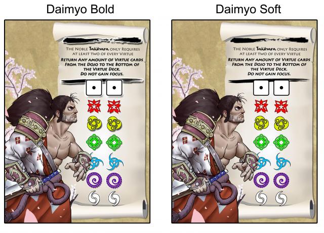
Soft
I think the soft version has a more natural feel. Bold seems like a black and white image that has been cut and pasted, but it does frame the text nicely; the soft seems more like the stroke of an ink brush and melds well with the card overall card.
That being said, the difference is subtle and although I prefer soft, I don't think you would go wrong with either.
nice work!