Explanation of Layout aka Why I have ugly yellow picture frames.

| Looking for some EURO abilities (0) by questccg |
| Some thoughts about heavy euro games (7) by questccg | |
| Epic Metal Monster Coin Update (1) by questccg |
| Why a SpaceGame (part 2) (44) by X3M |
| Blank Poker Card Sale - Only 3 Cents Each! (0) by The Game Crafter |
| 2025 Unpub Mentorship Program (0) by The Game Crafter |
| Prospector — I decided to have a dedicated BLOG for this "Expansion" (32) by questccg |
| Dead Steam - Post Apocalyptic train building card game (38) by Tbone |
| Board Game Blueprint - New Episode Every Wednesday (32) by The Game Crafter |
| Tabletop Game Jobs (0) by The Game Crafter |
| Protospiel Cleveland (0) by The Game Crafter |
| "Never Seven" - Playtest Rules - Suspended While the Game is Undergoing Modification (7) by Steve |
| New Board Game Pieces - Premium Mushroom & Premium Brown Mushroom (0) by The Game Crafter | |
| Weight of sorting (4) by X3M |
| Placing cards (planets) in specific positions (orbits) (4) by Tbone | |
| Designing from a personal pool of mechanism (36) by larienna |
| New Board Game Pieces - InFUNity Tiles (Hat Shape) (0) by The Game Crafter |
| New Auction: 1 Month of Advertising on FatherGeek.com (0) by The Game Crafter |
| DuelBotz: Sample New Card (19) by questccg |
| Comparing 2 new dice replace mechanics (2) by X3M |
| Happy New Year!!! (1) by questccg |
| How to design and balance a Rock-Paper-Scissor like mechanism (44) by X3M | |
| Monster Keep — Retiring this Design (0) by questccg |
| Build your own [insert game genre here] (13) by larienna | |
| Finalists Selected for the VHS Case Challenge (5) by larienna |
Comments
The good, bad and ugly... LOL
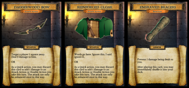
Okay so I think the good is the Bracers. They look pretty good.
The Bow is a bit SMALL. Maybe if you made it bigger it would look better and maybe use a 45 degree angle.
The Cloak seems to be the problem... It would probably be best to have a drawing of just the cloak (as if it was not worn by anyone...)
These were just examples. The
These were just examples. The size is not the problem. As I said, the chest pieces are the problem AND, I really don't know how to make this any clearer...
"I cannot drastically change or alter the drawing NOR can I commission new art of just the clothes/armor/weapons."
So, as I've stated, in order to keep everything UNIFORM, I either have the square box or I put the whole character in every picture.
I don't want to be a rude guy but, we're all designers and I feel like I'm building a house, I ask if they like A or B, then everyone tells me how they think they should do it, I tell them I already thought of that, they want proof with their own eyes, I show them, and they go.... "oh" ... and they never tell me if they liked A or B.
All this making examples and waiting for responses has honestly got me nowhere. It would have been better to not have asked the question at all. At least then, I would have 3 hours more to work. Sorry to go off like this, but I'm just frustrated.
GREYSCALE
That's the real source of your problem... Personally I would commission new art for each piece EVEN the Bow. For the bow, I would add a quiver and arrows inside (for an example).
Is this a budget thing? Or a timing issue (because of a CON)?? Or no artist to do the job???
Everyone is going to say ITEMS ALONE. Why? Because that is what most game do!
I have another IDEA for you... SOMETHING DIFFERENT to HELP with your specific problem:
That MIGHT help you with your specific issues... Just a thought!
Update: I would say the best thing would be artwork of just items. Like the Knights "boots", would be best if it was two (2) boots next to each other (picture a pair of cowboy boots nothing in them) ... that kind of boots.
I know this does diddly to help you with your problem. But I've already given you a couple ideas on how to HIGHLITE certain parts of each character for the purpose you are looking for...
Cheers.
Yes. There is no artist to
Yes. There is no artist to draw the items. I want all the items/cards to have the same art style, but the main artist doesn't do that type of work (no "items-only"). Also, I don't care to continue searching for a copycat artist and spend more money for a possible dead end.
The greyscale is a good idea. The only problem I can find is if I use something below the waistline, such as boots, because they will be covered up by the text box. Other than that, it's a great idea.
Toss them away!
Then why not just get RID of BOOTS as a item: Problem solved, nothing below the waistline!
They're only boots for freaken sakes...